Not every business offers products as hot and desirable as an iPhone or a Tesla Roadster. Sometimes a hammer is just a hammer – a tool designed to strike nails on a solid surface. But that shouldn’t stop you from making a standout page for your product. Create a boring page and it will negatively affect visitor experience and even hamper sales.
The key here is to craft a product page that will make your potential affiliates more likely to sign up and become ambassadors for your brand and drive traffic to you.
Why is a product page important for your affiliate program?
For starters, it may seem like your product pages don’t affect your affiliate program. But, the way you display your merchandise online is actually highly important from an affiliate-recruiting perspective.
When potential affiliates visit your website, they want to be assured that your product listings have a good chance of converting visitors into paid customers, because that is how they earn their commissions. If your pages lack in that area, it may be difficult to find marketers who will spread the word about your products and services.
On the other hand, affiliates who’ve already signed up for your program will grow frustrated if they’re working hard to send traffic your way but aren’t getting paid. This is why product pages are so important for your affiliate program.
To summarize, an engaging product page offers you the following benefits.
- It reassures trust in your affiliates that your product is worth buying.
- It improves their retention rate.
- It increases your product sales.
How to create an engaging product page?
Now that you’ve learned why you need to make your product page engaging, it’s time to learn how to create one. There are ideally 6 components to a great product page:
- Product image
- Product description
- Calls to action
- Social proof
- Page load time
- Help & support
Let’s break these down and understand them using examples.
1. Display enticing product images
Would you trust a website that failed to properly photograph their products? Of course not. The single most important element of your product page is your product image.
Vincent Bucciachio, founder of SociallyInfused Media says:
“Invest in exceptional product photography. We’ve built hundreds of product pages, and I can confidently say that people do judge a book by its cover when they are making online purchases.”
And, that’s true, especially for apparel and cosmetic products. Usually, brick-and-mortar stores have an advantage over online stores when it comes to such products. A potential customer has the opportunity to view a shirt or a bag in person, touch it, and observe every detail.
Having said that, using the right visual elements for your product image on your eCommerce store can help close that gap.
“Successful deodorant brand, Lume, has—in my opinion—one of the best product pages I’ve ever seen. They were able to maintain a perfect balance between useful product information, CTAs placed at the right place, customer reviews, and witty marketing copy.”
– Raul Galera of CandyBar
If you check out Lume’s product page, you will definitely agree with Raul. First, let’s take a look at Lume’s product image below.
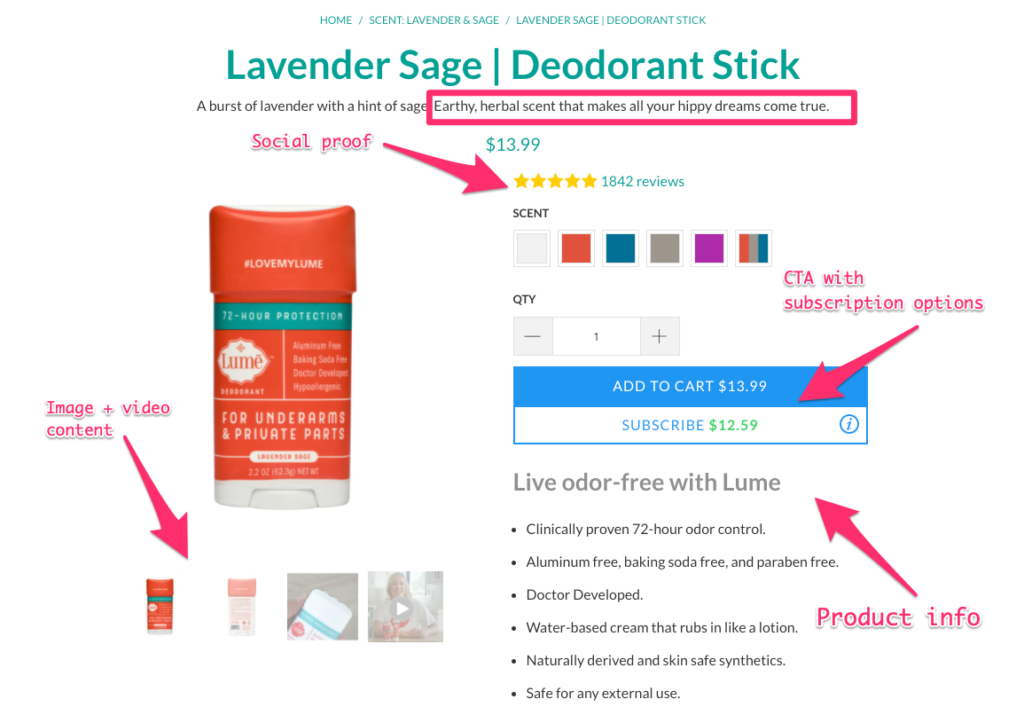
It is clean. It is large. It looks like it is worth the price.
Let’s gather some tips from it:
- Place the product image in the center of the frame.
- Have a white or light-colored background with soft to no shadows.
- Take multiple photos of your product from various angles.
- Have a video of the product if possible.
It may feel like a lot of work, but the results you obtain later will be immense. But, in case you’re selling the same products on other marketplaces such as Amazon, Shopify, Etsy, etc, you can simply sync your online stores without having to manually move the content from one store to another. For example, if you have hosted your store on Shopify, you can sync it to your Etsy store also. In other words — two birds, one stone.
2. Use clear and informative product description
Providing enough useful information about your products makes it easy for affiliate marketers to promote them.
Many of the affiliates use the information you provide on your product pages in their promotion campaigns. Bloggers, for example, can take that information and create blog posts that have high conversion rates. Ben Aston has done this in his long-form blog post comparing different resource scheduling software.
But if you’re selling physical items, let’s take the above example from Lume Deodorant once again.
Knowing that deodorant isn’t an impulse purchase, but rather something that customers (generally) research about before trying out, Lume displays more information about the product and the company as the user scrolls down the page: product specifications, ingredients, benefits (with UGC), a message from the founder and lastly, a large collection of customer testimonials.
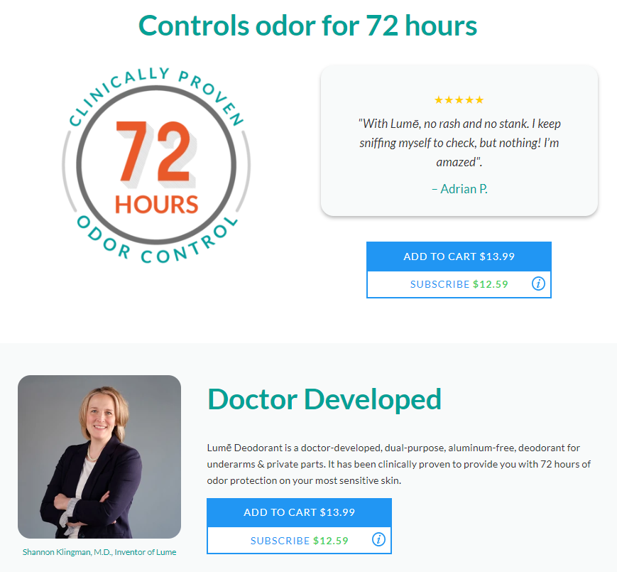
They have a crisp product description on their page that answers most of the common questions.
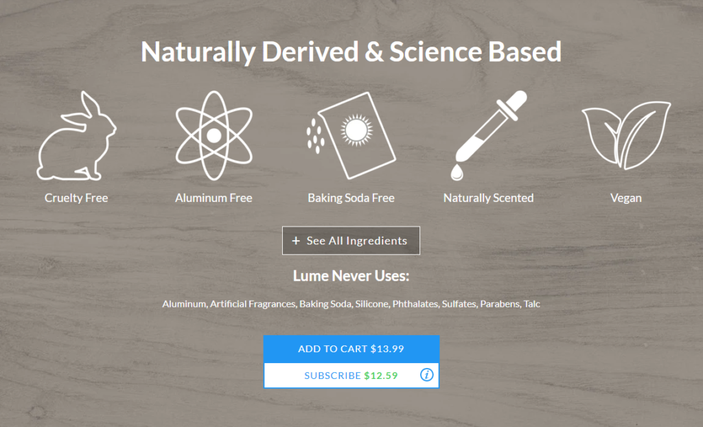
So, an effective and straightforward approach to creating great product descriptions is the journalist’s approach. Typically, when journalists write a story, they answer six questions – Who, What, Where, When, Why, and How.
You can use a very similar approach to make sure you’re providing all the necessary product information.
Pro tip: Translate your product description into other languages to reach a wider audience.
3. Guide your visitors with proper CTAs
Visitors who don’t click don’t convert. That’s what CTAs are for. CTA stands for Call to Action. On eCommerce sites like Amazon, they are usually featured as a Buy Now or Add to Cart buttons.
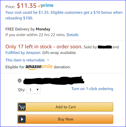
They are crucial because they guide customers towards making a purchase or complete a certain action. Not just that, but a study shows 90 percent of eCommerce visitors who read your product page titles will also read your CTA copy. So, a proper CTA with a clear copy is very important.
Lume did a great job on their product page displaying their CTAs clearly.

Another great example of clear CTAs is HubSpot. They make sure that their product descriptions smoothly guide their visitors to a relevant action step.

Source: HubSpot
Here are a few tips for optimizing your CTAs:
- Make your CTA copy compelling that it evokes action. For example, “Try Our Free Demo” or “Buy Now”.
- Experiment with different button color choices that suit your brand. Choose one that matches your page’s design but still stands out.
- Use large and legible text that is big enough to read and capture viewers’ attention quickly.
- Create a sense of urgency in your copy to improve click-through rates. For example, you could try “Sign up today and get 30 percent off!”
4. Improve page load time
3 seconds or less. That should be your page load time according to Google.
Speed matters, especially when it comes to an online experience. That’s the reason why fast food is really popular. That’s the reason why Amazon Prime thrives on faster delivery, and that’s the reason why I gave you a quick answer right in the first line above.
Improving the speed of your product pages is therefore key to maximizing conversions and keeping your affiliates happy. There are a number of ways to do that:
- Compress image files
Images take up somewhere between 50% to 75% of your page’s total assets. The higher the quality of your images, the bigger that number gets. But there are tools such as TinyJPG, TinyPNG, or TinyImage that allow you to minimize the size of the images without losing quality with lossless compression.
Remember that each image you use on your page creates a new HTTP request.
Also, watch out for empty image sources like <img src = ‘ ’> in your page’s code. These can cause extra burden on the user’s browser to send yet another request to your servers.
- Minify your website code
Poorly coded HTML, CSS, and JavaScript on your web page can slow down your site’s performance. Minification helps you remove that. Also, minimize white space, line returns and comment tags.
- Use a Content Delivery Network (CDN)
CDN stands for Content Delivery Network or Content Distribution Network. It is a group of servers distributed all around the world that disperses the content delivery load through the nearest server to your webpage visitor’s location. This makes the user experience of local users faster.
- Uninstall unused WordPress plugins and themes (if your online store is hosted on WordPress)
Unused WordPress themes and plugins installed on your website can slow it down drastically. Especially themes take up disk space and increase the size of your site’s backup file.
Having said that, you don’t have to delete all of your themes and plugins. They add additional functionality that your website lacks. Your goal should be limiting the number of plugins running on your site. A general rule is to keep the number below 5 for better website health.
Note: Make sure that you update themes and plugins regularly whenever there is an update. Otherwise, your website becomes vulnerable to security breaches.
- Use a reliable hosting service
Your website hosting service and infrastructure can influence your site’s performance. Using an unreliable host provider can cost you badly, like what happened with Lowe’s during the Black Friday sale of November 2018.
Find and use a web hosting service that can handle the load even during high-traffic days.
Note: Before any major sales event, ask your hosting provider to help you prepare for unexpected traffic spikes or a heavy influx of orders. Also, make sure you load test your site at 5 times the normal traffic to be better prepared for unexpected outages.
Here are a few more ways to improve your page load time.
5. Show social proof
Hear this. You are shopping online for a new pair of shoes. You land on a website and start looking for them. And as you do, you ask yourself questions like these —”Can I trust this site? Is this a legit business?”
These are fair questions that a lot of your visitors will have. To give them the assurance, incorporate customer reviews on the product page. It’s important to provide real evidence to your affiliates that your customers have found value using your products before.
Lume made sure that they have great reviews on their product page.
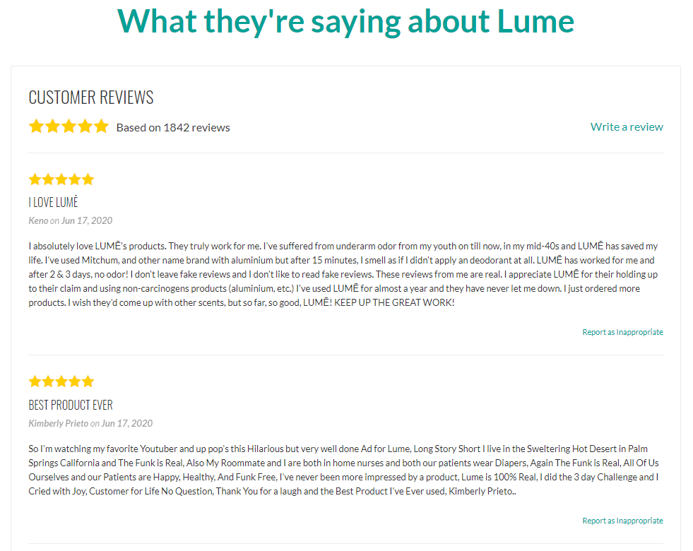
But if you don’t have those, you can send a friendly nudge in the form of real-time, real-people notifications.
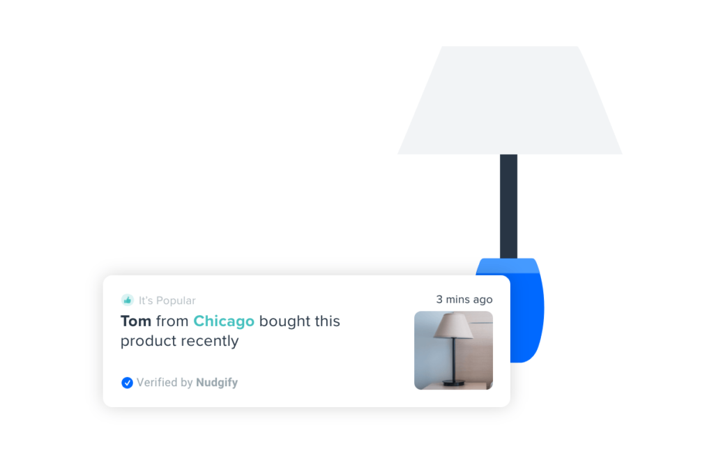
Source: Nudgify
That’s the power of social proof. It has become an important part of eCommerce shopping because it is hard to know who and what we can trust online. In an uncertain environment, social proof helps us make better decisions about who to trust and what to buy.
6. Include a section for help and support
When people visit your website, they typically come for a certain purpose.
Whether they are somebody who has already bought from you or somebody who has yet to make a purchase, they want answers, and they want them fast. It may even be about your product or service.
But there will be times when the information found on your product page is not enough. That’s when the need to invest in a live chat software arises. This is not just a way to interact with your customers. It’s a broad concept that involves untapped potential that enables you to create a good rapport with your visitors and boost your conversion rates.
And there are great benefits to employing live chat software:
- It improves user experience as visitors will have an answer source for their questions.
- It shortens your sales cycle as visitors will be closer to making a purchase after obtaining the necessary information.
- It increases conversions as your prospective customers get their answers much faster.
- It is far less expensive than the phone support way of customer service.
You can’t afford to let your website visitors leave your store without buying. Traffic doesn’t come cheap. So make every visitor count.
Pro tip: Live chat should be available 24/7 as your store gets traffic from all over the world at different time zones. Never leave your customers alone.
Product page best practices
So, what have these brands taught us about creating an engaging product page? It boils down to the following:
- Make it fun even though you have an uninteresting product.
- Make it informative (use detailed product descriptions and social proof)
- Make it easy for your visitors to find what they’re looking for (your CTAs need to be clear).
- Make it load faster and optimized for mobile viewing.
Conclusion
So, there you go. By optimizing your product pages, you get more affiliates, more visitors, more traffic, and ultimately more revenue.
Start implementing these today!
If you want some inspiration, here is a list of some of the best ecommerce product pages on the web for you to check out.
Author BIO
Vimal Bharadwaj is a Product Marketer at Automate.io. He is passionate about all things B2B SaaS. While he’s not working, you can see him watching an NBA game, playing basketball, reading a book, or ranting about something that in no way affects his life. His goal in life is to constantly learn and get better before the robot overlords take over the world in the year 2050.
Frequently Asked Questions
What are 3 main components of a successful affiliate marketing program?
1. Quality products or services to promote 2. Clear and attractive commission structures 3. Effective tracking and reporting systems for affiliates
What are 3 main components of a successful affiliate marketing program?
1. Quality products or services to promote 2. Clear and attractive commission structures 3. Effective tracking and reporting systems for affiliates
Share this article
9 affiliate marketing tools that’ll help you run your affiliate program
Discover 9 essential tools to supercharge your affiliate marketing program! From visual content creation with Visme to comprehensive management with Post Affiliate Pro and audience insights via Smartlook, these tools will boost your sales and refine your strategy. Dive in to maximize your affiliate success!
How To Find Affiliates to Sell Your Products
Discover over 10 successful strategies for finding high-quality affiliates in 2024 to boost your product sales. Learn to leverage influencers, join affiliate networks, and enhance your reach through SEO and social media. Maximize revenue with transparency and ongoing monitoring in your affiliate marketing program.
Post Affiliate Pro recognized as a Category Leader by SourceForge
Post Affiliate Pro named Category Leader by SourceForge for its powerful affiliate features, top user reviews & 24/7 support. Try it now!
Affiliate marketing email templates
Discover expertly crafted email templates for affiliate marketing with Post Affiliate Pro. Enhance your communication by motivating, acknowledging, and engaging affiliates effectively. From terms and conditions to product launches, these templates ensure clear and consistent messaging to boost your affiliate program's success. Visit now to streamline your affiliate communication!


