


Why Is Above the Fold Important?
Discover why above the fold matters for user engagement, conversions, and SEO. Learn best practices for optimizing your website's most valuable real estate with...
10 min read
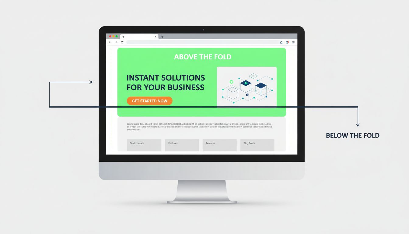
Above the fold is the portion of a web page that is visible in the browser window the moment a visitor lands on it — before they scroll, click, or interact in any way.
Above the fold is the portion of a web page that is visible in the browser window the moment a visitor lands on it — before they scroll, click, or interact in any way. Everything beyond that initial viewport boundary is below the fold.
The phrase describes the first screenful of content: the headline, hero image, navigation, and any call-to-action that loads without scrolling. It is the single highest-visibility zone on any page.
In web design, above the fold (often abbreviated ATF) means the visible area of a webpage before any scrolling occurs. The “fold” is the imaginary line at the bottom of the browser window — the cutoff between what a visitor sees immediately and what requires action to reveal.
The term does not describe a fixed pixel height. On a 27-inch desktop monitor, the fold might sit around 900–1,000 pixels from the top. On a phone held in portrait mode, it may be only 500–600 pixels. The fold shifts with every device, screen size, browser toolbar, and zoom setting.
Three questions the above-the-fold area should answer almost instantly:

Set up advanced tracking in minutes. No credit card required.
The term originates in print newspaper publishing. Physical newspapers were folded in half on newsstands. Only the top half of the front page was visible to passersby. Editors placed the most important headlines, striking photographs, and lead stories in that space to grab attention and drive purchases.
The same logic carried into early web design in the 1990s. Designers adopted the “fold” concept to describe what users see before scrolling — the digital equivalent of the newsstand display.
Unlike newsprint, however, a web page has no physical crease. The fold is virtual, defined entirely by the visitor’s viewport.
Above-the-fold content determines whether a visitor stays or leaves.
A visitor forms an impression of a page within roughly 50 milliseconds. If the above-the-fold area looks cluttered, confusing, or irrelevant, the bounce rate climbs. Pages that clearly communicate purpose and value in the initial viewport see measurably lower abandonment.
Calls-to-action, signup forms, and key offers placed above the fold consistently outperform those buried further down.
Google’s page-experience signals and Core Web Vitals reward pages where the main content loads quickly and is immediately accessible. While the fold itself is not a direct ranking factor, pages that push substantive content below intrusive interstitials or large hero images risk demotion. Content that is harder to reach is content that ranks less competitively.
| Factor | Above the Fold | Below the Fold |
|---|---|---|
| Visibility on load | Immediate | Requires scrolling |
| CTA conversion potential | Highest | Lower, but still valuable for in-depth readers |
| SEO weight | Heavier — Google reads top-down | Lighter — still indexed, less influential |
| Best content types | Headline, value prop, primary CTA | Details, testimonials, FAQs, secondary CTAs |
Be the first to know about new features and product updates.
There is no single fold line. The fold varies with:
The most common mobile viewport is approximately 390×660 pixels. This means mobile visitors see roughly half the vertical content that desktop visitors do — making mobile above-the-fold design more constrained and more critical.
Web designers and marketers use several methods to measure where the fold falls:
The 600-pixel rule of thumb from the early 2000s is obsolete. Designers now treat the fold as a fluid concept and test across at least five viewport widths: 390px (small phone), 428px (large phone), 768px (tablet portrait), 1024px (tablet landscape / small laptop), and 1440px (desktop).
Yes — but not the way it was understood a decade ago. The idea that all critical content must sit strictly above the fold is outdated. Users do scroll, and they scroll frequently. Social media feeds, infinite-scroll news sites, and short-form video platforms have trained people to swipe and scroll as second nature.
However, above-the-fold content still determines whether a visitor decides to scroll at all.
Obsolete advice:
Current best practice:
The exact mix depends on the page type. A homepage, a landing page, and a blog article all serve different goals.
Affiliate marketers — whether advertisers, publishers, or program managers — rely on above-the-fold placement to maximize visibility, clicks, and conversions.
Your affiliate landing pages must communicate value immediately. If a referred visitor lands on a page and the headline, offer, or CTA is buried below the fold, the click you paid for is wasted.
Affiliate links and banners placed above the fold generate significantly more impressions and clicks than those in sidebars or footers. However, Google’s ad-placement guidelines penalize pages that push content below an excess of above-the-fold ads.
When you review affiliate applications and monitor partner performance, evaluate where your affiliates place your links. Affiliates who position your offers above the fold on high-traffic pages tend to drive the most conversions. Use that data to:
| Role | Above-the-Fold Priority | Key Metric |
|---|---|---|
| Advertiser | Landing page headline and CTA | Conversion rate |
| Publisher | Contextual link or banner placement | Click-through rate |
| Program manager | Placement quality across affiliates | Revenue per click |
The short answer: place your primary CTA above the fold, and include supporting CTAs below.
A CTA above the fold captures visitors who decide quickly. These are high-intent users — they arrived knowing what they want and need only the right prompt to act.
A CTA below the fold serves visitors who need more information. After reading benefits, testimonials, or product details, they convert with greater confidence. These conversions often have higher average order values and lower return rates.
Neither placement is universally superior. The most effective pattern, validated across thousands of A/B tests, is:
Test both placements. Track not just clicks but completed conversions. A CTA that generates many clicks above the fold but few completions may be attracting the wrong audience. A CTA below the fold with fewer clicks but higher completion rates may be better qualified.
Learn best practices and strategies to maximize the impact of your above-the-fold content for higher engagement and conversions.
Discover why above the fold matters for user engagement, conversions, and SEO. Learn best practices for optimizing your website's most valuable real estate with...
Discover the origins of 'above the fold' from newspaper printing to modern web design. Learn how this concept impacts user engagement, SEO, and conversion rates...
Learn proven strategies to optimize above the fold content with strong H1 tags, keyword placement, image optimization, and mobile-first design. Boost conversion...
Join our community of happy clients and provide excellent customer support with Post Affiliate Pro.



Cookie Consent
We use cookies to enhance your browsing experience and analyze our traffic. See our privacy policy.