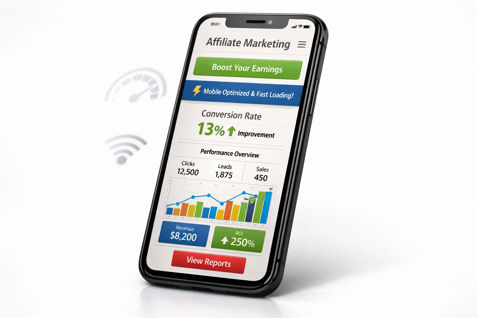
Mobile-friendliness in affiliate marketing: why it matters
Why mobile-friendliness is a real ranking and revenue factor in affiliate marketing, from Core Web Vitals to responsive design, and how to test and fix your affiliate site for mobile.
Why mobile-friendliness matters for affiliate marketing
If you have read our mobile affiliate marketing
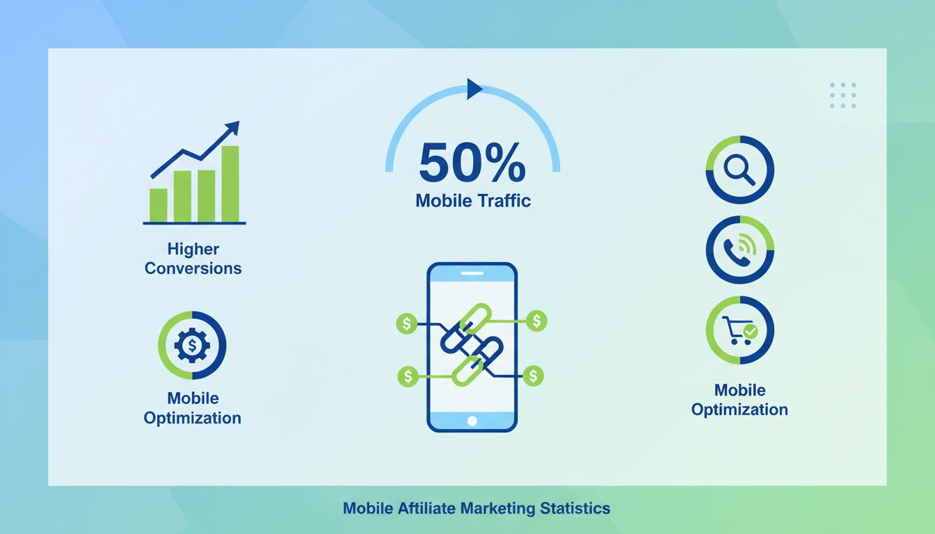
guide, you already know how much of the promoting, sharing, and clicking happens on a phone. This article looks at the other side of that same coin: what happens on your own site once that mobile visitor actually lands there. Mobile devices account for just over half of all global web traffic, a lead they have held for years now (StatCounter
). For affiliate marketers, that is not a statistic to admire from a distance, it is half your audience judging your site on a small screen right now.
Mobile-friendliness stopped being a nice-to-have feature a long time ago. A site that loads slowly, scrolls awkwardly, or buries its call-to-action behind a clumsy menu does not just annoy visitors, it quietly bleeds commissions. Someone who taps an affiliate link, waits too long, and bounces before the page even finishes loading was never a lost sale you can see in your analytics, they simply vanish. This guide walks through what actually moves the needle: page speed, responsive design, mobile user experience, and the SEO consequences of getting any of it wrong.
Mobile traffic is not evenly spread across channels
Not every visitor arrives the same way, and that matters for how you prioritize mobile fixes. Social media traffic skews heavily mobile, since most people scroll Instagram, TikTok, and Facebook from their phone rather than a desktop browser. Search traffic is more mixed, split fairly evenly between mobile and desktop depending on the query and the device someone happens to be using at that moment. Email tends to lean mobile too, particularly for time-sensitive offers people check the moment a notification arrives, while direct traffic, people typing your URL or using a saved bookmark, often comes from whichever device they set that habit up on originally, which skews slightly more toward desktop.
The practical takeaway is not a single number to memorize. It is a diagnostic habit: look at your own analytics by channel before you assume equal effort everywhere. A social-heavy affiliate site has almost no margin for mobile mistakes, while a site built mostly on returning direct traffic has a bit more room, though not much, given how the trend keeps moving.
Launch your affiliate program today
Set up advanced tracking in minutes. No credit card required.
Page speed is one of the clearest, most measurable levers in mobile optimization. A joint study by Google and Deloitte, analyzing more than 30 million mobile sessions across 37 brands, found that improving mobile site speed by just 0.1 seconds lifted conversion rates by 8.4% for retail sites and 10.1% for travel sites (web.dev
). That is not a typo, a tenth of a second, repeated across a full user journey, moved revenue by double digits.
Mobile users are also simply less patient than desktop users, since they are frequently on the move, on a weaker connection, or juggling attention with something else entirely. A slow page does not just frustrate them, it signals poor quality to search engines too, which can drag your rankings down alongside your conversions. A handful of well-understood fixes account for most of the improvement:
Image compression, using modern formats like WebP to cut file size without a visible quality loss.
Lazy loading, so images and content further down the page only load once someone actually scrolls to them.
A content delivery network, which serves your site from servers physically closer to each visitor.
Minification, stripping unnecessary characters out of your CSS, JavaScript, and HTML files.
Browser caching, so returning visitors do not re-download assets they already have.
Cutting autoplay video, which quietly eats bandwidth and slows everything else on the page.
Responsive design is still the foundation
Responsive design remains the standard approach for mobile-friendly affiliate sites, and Google explicitly recommends it as best practice. Rather than maintaining a separate mobile site, a responsive layout adjusts itself automatically to whatever screen it is displayed on, which also happens to simplify maintenance and cut development costs compared to running two versions of the same site. A few principles do most of the work here.
Fluid grids use percentage-based widths instead of fixed pixels, so layouts flex naturally.
Flexible images scale proportionally with their container instead of overflowing or shrinking awkwardly.
Media queries apply different styles depending on screen width, so a phone and a laptop can render the same page differently on purpose.
A mobile-first approach designs for the smallest screen first, then adds complexity for larger ones, rather than the reverse.
Sensible breakpoints, commonly around 320px, 768px, and 1024px, mark where the layout should visibly adjust.
Flexible typography uses relative units so text scales sensibly across devices instead of becoming unreadably small or awkwardly huge.
Touch-friendly elements give buttons and links enough size and spacing that a thumb can hit them reliably.
Join our newsletter
Be the first to know about new features and product updates.
Mobile user experience decides whether people convert
A technically fast, responsive page can still lose visitors if the experience itself feels wrong on mobile. People on phones tend to be on the go, working with less attention and less patience than someone sitting at a desktop, so every extra step between landing on your page and clicking an affiliate link costs you a share of your audience. The details that matter most are mostly about respecting how a thumb, not a mouse, actually navigates a screen.
Keep interactive elements within comfortable thumb reach, generally the center and lower half of the screen, and use text no smaller than 16px with enough line spacing that reading does not feel like squinting. Navigation should collapse into something simple, a hamburger menu or a short, obvious set of links, rather than forcing someone to hunt through a desktop-style menu on a six-inch screen. Forms should ask for as little as possible and support autofill, since typing on a phone keyboard is friction most people would rather avoid entirely. Calls-to-action need to be visually obvious and action-oriented, pop-ups should be rare and easy to dismiss, and every tap or scroll should respond instantly, since lag reads as broken even when it is not.
Mobile SEO and what Google actually ranks
Mobile SEO carries real weight now, not as a minor ranking signal but as the default lens Google uses to evaluate your entire site. Google began shifting toward mobile-first indexing in 2016, rolled it out gradually over several years, and confirmed in October 2023 that the transition was complete across the web (Google Search Central
). In practice, that means the mobile version of your page, not the desktop one, is what Google actually crawls, indexes, and ranks you on.
Core Web Vitals sit at the center of that evaluation. The three current metrics are Largest Contentful Paint, which measures how quickly the main content loads, Cumulative Layout Shift, which measures whether elements jump around unexpectedly as a page loads, and Interaction to Next Paint, which replaced the older First Input Delay metric in March 2024 to better capture how responsive a page feels across an entire visit, not just on the first tap (web.dev
). A site that scores poorly on any of these is working against itself twice, once in search rankings and once in the conversions that never happen because a frustrated visitor already left.
Measuring what your mobile visitors actually do
None of the fixes above mean much without a way to check whether they worked. Google Analytics 4 gives a solid mobile-specific view of behavior out of the box, and pairing it with a tool built for affiliate tracking, so you can see mobile conversions and commissions alongside the traffic data, closes the loop between a technical fix and its actual revenue impact. If your mobile conversion numbers look off rather than just low, that is usually a tracking issue rather than a speed or design one, and our guide to setting up mobile affiliate conversion tracking
covers the fix. A handful of metrics are worth watching on a recurring basis rather than checking once and forgetting:
Bounce rate, ideally kept below 50% for mobile visitors.
Time on page, where healthy engagement usually runs a couple of minutes or more.
Conversion rate, tracked separately for mobile so you can see the gap against desktop directly.
Pages per session, since a visitor exploring more than one page is a good early signal of interest.
Mobile share of total traffic, so you know how much of your audience these numbers actually represent.
Common mobile mistakes worth checking for
A few mistakes show up again and again on affiliate sites, and most of them are quick to fix once you know to look for them. Slow load times are the most common, usually solved with the compression, caching, and CDN changes covered earlier. Cluttered or confusing navigation frustrates mobile visitors fast, so clear labels and a simple menu structure go a long way. Unoptimized images, ones that are full desktop resolution shrunk down by the browser rather than properly resized, waste bandwidth for no visual benefit. Intrusive pop-ups that cover the whole screen are one of the fastest ways to lose a mobile visitor entirely, and a sticky header or a small bottom banner almost always works better. Forms that were never actually tested on a phone tend to have hidden friction, a field that is awkward to tap or a button hidden below the keyboard, that only shows up once someone tries to use it for real. And a call-to-action that blends into the page rather than standing out costs conversions quietly, without ever showing up as an obvious error.
Building a mobile-first affiliate strategy
Beyond fixing what is broken, the affiliates and programs doing best on mobile tend to design for it from the start rather than adapting a desktop plan after the fact. Content works better short and scannable, built around how people actually read on a phone rather than how they read a long article on a laptop. Short-form vertical video, the kind built for TikTok, Instagram Reels, and YouTube Shorts, reaches an audience that is already primed to watch on mobile. SMS and push notifications drive strong engagement for time-sensitive offers precisely because they land on the one device someone almost never leaves at home. Email deserves the same mobile-first treatment, with large buttons, short subject lines, and minimal scrolling, since most people check their inbox from their phone first. And checkout itself should support the payment methods people already have saved on their phone, like Apple Pay and Google Pay, since every extra step at checkout is a chance to lose someone who was already convinced.
Tools worth using
You do not need an expensive stack to get most of this right. Google PageSpeed Insights and the built-in Lighthouse audit in Chrome DevTools both give a free, specific breakdown of what is actually slowing your mobile site down. GTmetrix adds a bit more detail on where those bottlenecks live. BrowserStack and the Responsively App let you check how your layout actually behaves across real devices and screen sizes instead of guessing. And on the analytics side, Google Analytics 4 and a tool like Hotjar, which shows heatmaps and real session recordings, make it obvious where mobile visitors are getting stuck, rather than leaving you to infer it from numbers alone.
Getting mobile-friendliness right is not a one-time project. It is closer to maintenance: worth checking after every design change, and worth revisiting every time you look at the broader picture of how mobile affiliate marketing works
end to end, since the traffic you are optimizing this page for is the same traffic that guide is helping affiliates reach in the first place.
Frequently asked questions
Mobile devices account for just over half of all global web traffic, and have held that lead for years. The exact share varies by niche and audience, but for most affiliate sites, mobile is either the largest single traffic source or close to it, which is why mobile optimization is no longer optional.
Yes. A Google and Deloitte study of over 30 million mobile sessions found that a 0.1 second improvement in mobile site speed lifted conversion rates by 8.4% for retail sites and 10.1% for travel sites. Small speed gains compound into real revenue, especially on mobile, where patience runs out faster.
Yes. Google now crawls and ranks the mobile version of your site by default, a rollout it confirmed as complete for the entire web in October 2023. If your mobile experience is broken or slow, that is the version Google judges you on, regardless of how good your desktop site looks.
Free tools like Google PageSpeed Insights, GTmetrix, and Chrome's built-in Lighthouse audit will test your site and flag specific problems. Run one after any design change, since a small tweak on desktop can quietly break the mobile layout without anyone noticing until conversions drop.
Ready to optimize your affiliate campaigns for mobile?
PostAffiliatePro helps you track mobile conversions, analyze user behavior across devices, and optimize your affiliate marketing strategy for maximum mobile revenue. Start tracking your mobile performance today.
Mobile affiliate marketing guide: everything you need to know
A beginner-friendly guide to mobile affiliate marketing: what it is, how to start affiliate marketing with your phone, and the tools that make it work.
Why your mobile affiliate traffic isn't converting (and how to fix it)
Your affiliates are sending mobile clicks, but the sales don't match. Here are the six most common reasons mobile affiliate traffic goes untracked, unconverted,...
Mobile Impact on Affiliate Marketing to Mobile-First Success
Discover how mobile devices dominate affiliate marketing with 50%+ traffic share. Learn mobile optimization strategies, app-based marketing, and conversion tact...
10 min read
You will be in Good Hands!
Join our community of happy clients and provide excellent customer support with Post Affiliate Pro.