What Colors Are Best for Advertising Food? | Color Psychology Guide
Discover the best colors for food advertising in 2025. Learn how warm colors like red and orange stimulate appetite and drive customer engagement with proven color psychology strategies.
What colors are best for advertising food?
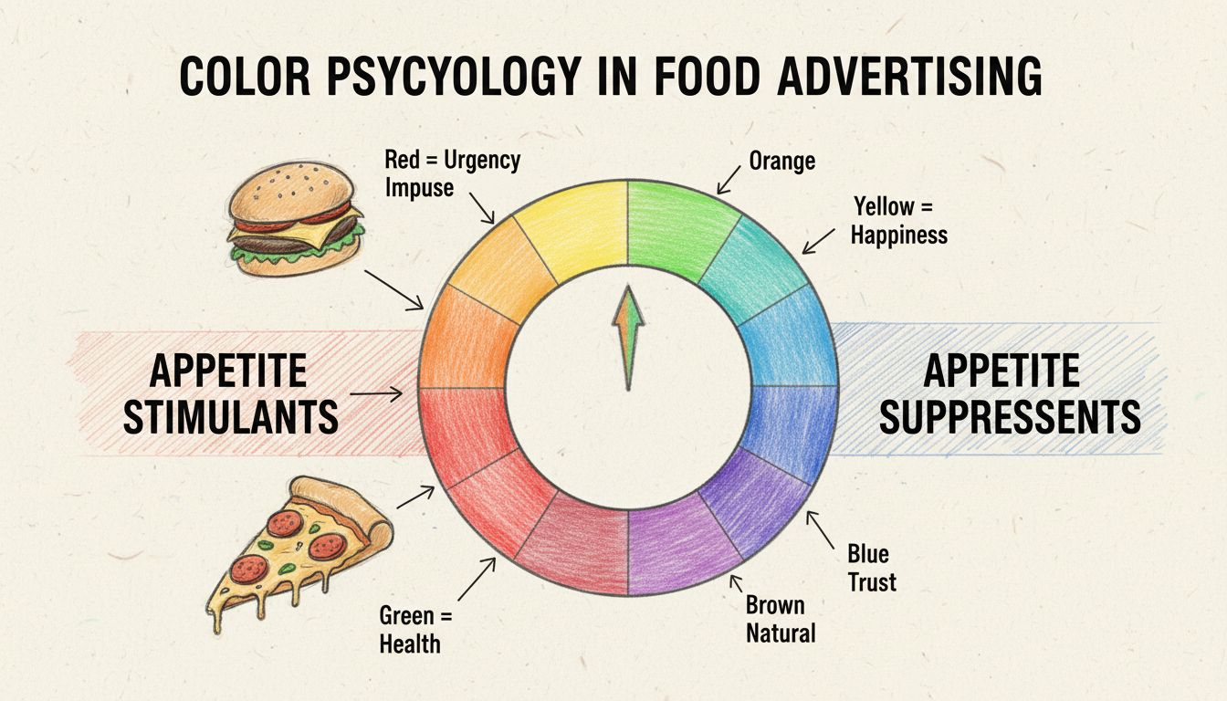
Warm colors such as orange and red are wise since they evoke hunger pangs in the viewer. Red stimulates appetite and increases heart rate, while orange encourages impulse purchases. Yellow creates happiness and friendliness, making these colors ideal for fast-food and casual dining brands.
Understanding Color Psychology in Food Advertising
Color psychology is far more than aesthetic preference—it’s a scientifically-backed tool that directly influences consumer behavior, appetite stimulation, and purchasing decisions in the food industry. When customers encounter food advertising, their brains process color signals within milliseconds, triggering emotional and physiological responses that can determine whether they purchase a product or scroll past it. The relationship between color and appetite is rooted in evolutionary biology and cultural conditioning, making certain colors universally effective across different demographics and markets. Understanding these color principles is essential for any food brand looking to maximize visibility, increase sales, and create memorable customer experiences in 2025’s competitive marketplace.
The Science Behind Warm Colors and Appetite Stimulation
Warm colors—particularly red, orange, and yellow—have been scientifically proven to stimulate appetite and trigger hunger responses in viewers. Red is the most powerful appetite stimulant because it increases heart rate and blood pressure, creating a sense of urgency and excitement that encourages immediate action. This physiological response occurs because red is associated with energy, passion, and intensity, making food appear more vibrant and desirable. Orange, being closely related to red on the color spectrum, shares similar appetite-stimulating properties while adding a layer of friendliness and approachability that makes brands feel more inviting and accessible. Yellow complements these warm tones by evoking happiness, optimism, and warmth, creating a welcoming atmosphere that encourages customers to engage with the brand and make purchasing decisions.
The combination of red and yellow is particularly powerful in fast-food branding because it creates a dual psychological effect: red triggers hunger and urgency, while yellow generates positive emotions and happiness. This is why McDonald’s, KFC, Burger King, and Pizza Hut have built their entire brand identities around these colors—they’ve discovered through decades of marketing research that this combination drives impulse purchases and increases customer frequency. The effectiveness of warm colors extends beyond just visual appeal; they actually influence how consumers perceive the taste and quality of food, making products appear fresher, more flavorful, and more satisfying than they might otherwise seem.
Launch your affiliate program today
Set up advanced tracking in minutes. No credit card required.
Color Selection by Food Category and Brand Positioning
Different food categories require different color strategies based on consumer expectations, brand positioning, and the psychological associations customers have with specific colors. The following table demonstrates the optimal color choices for various food segments and explains the reasoning behind each selection:
Food Category
Best Colors
Psychological Effect
Brand Examples
Fast Food & Casual Dining
Red, Yellow, Orange
Creates urgency, excitement, and encourages quick decisions
McDonald’s, Burger King, Wendy’s, Fanta
Healthy & Organic Foods
Green, Brown, White
Signals freshness, natural ingredients, and purity
Whole Foods, Clif Bar, Kind Snacks, Tropicana
Luxury & Gourmet Foods
Black, Gold, Dark Purple
Conveys sophistication, exclusivity, and premium quality
Godiva, Lindt, Ferrero Rocher, fine dining brands
Sweet Treats & Desserts
Pink, Purple, Light Blue, Brown
Feels playful, indulgent, and rich
Baskin Robbins, Cadbury, Hershey’s, M&M’s
Beverages - Water & Sports
Blue, White, Green
Represents freshness, hydration, and health
Perrier, Gatorade, Aquafina, Tropicana
Beverages - Soda & Energy
Red, Orange, Yellow
Conveys excitement, fun, and energy
Pepsi, Red Bull, Fanta, Monster Energy
Beverages - Alcoholic
Black, Gold, Burgundy
Suggests maturity, premium quality, and sophistication
Premium wine brands, craft beer, luxury spirits
This categorization demonstrates that there is no universal “best” color for all food advertising—instead, the optimal color choice depends on the specific product type, target audience, and brand positioning. A luxury chocolate brand using bright red and yellow would confuse customers and undermine its premium positioning, just as an energy drink using soft pastels would fail to convey the excitement and intensity consumers expect. The key to successful food branding is aligning color psychology with brand identity and customer expectations.
Individual Color Effects and Marketing Applications
Red: The Ultimate Appetite Stimulant and Urgency Driver
Red is the most powerful color in food advertising because it simultaneously stimulates appetite and creates psychological urgency. This color increases heart rate and blood pressure, making food appear more appetizing and encouraging impulse purchases. Red works exceptionally well for fast-food brands, limited-time offers, and products positioned as exciting or indulgent. The color’s effectiveness is so well-established that it dominates the fast-food industry, where quick decision-making and high transaction volume are critical business objectives. Red also works well in promotional contexts, where it signals special deals or limited availability that encourage customers to act immediately rather than delay their purchase.
Orange: Friendly Impulse Buying and Approachability
Orange combines the appetite-stimulating properties of red with the friendliness and approachability of yellow, making it ideal for brands that want to appear energetic without being aggressive. Orange encourages impulse purchases and is particularly effective for snack foods, casual beverages, and products targeting younger demographics. The color conveys enthusiasm, fun, and affordability, making it popular among brands like Fanta, Cheetos, and Reese’s that want to position themselves as accessible and enjoyable. Orange is also effective in retail environments where it draws attention to products on shelves and encourages customers to grab items without extensive deliberation.
Yellow: Happiness, Warmth, and Customer Welcome
Yellow is the color of happiness, optimism, and warmth, making it essential for creating welcoming brand environments. When paired with red in fast-food branding, yellow amplifies the positive emotional response and makes customers feel cheerful and energized. Yellow works particularly well for breakfast foods, casual dining, and family-oriented restaurants where creating a warm, inviting atmosphere is important. The color also enhances perceived value and makes customers feel that they’re getting good quality at reasonable prices, which is why it appears so frequently in discount and casual dining establishments.
Green: Health, Freshness, and Natural Positioning
Green represents health, freshness, natural ingredients, and environmental sustainability, making it the color of choice for organic, plant-based, and health-conscious food brands. Green appeals to consumers who prioritize wellness and are willing to pay premium prices for products they perceive as healthier and more sustainable. Brands like Whole Foods, Subway, and Green Giant have built their identities around green to signal their commitment to natural ingredients and health benefits. Green also works well for beverages, particularly water and sports drinks, where it reinforces the message of hydration and natural refreshment.
Blue: Trust, Cleanliness, and Appetite Suppression
Blue is unique in food advertising because it simultaneously suppresses appetite while conveying trust, cleanliness, and reliability. This makes blue ideal for products where trust and safety are paramount concerns, such as dairy products, water, and diet foods. Blue is rarely found in nature as a food color, which is why it doesn’t trigger hunger responses; instead, it creates a sense of calm and security. Brands like Pepsi use blue to position themselves as refreshing and trustworthy, while dairy brands use blue to emphasize cleanliness and purity. Blue works well for premium water brands and health-focused beverages where the message is about wellness rather than indulgence.
Brown: Natural, Warm, and Comforting
Brown evokes warmth, reliability, and natural flavors, making it perfect for coffee, chocolate, and bakery brands. Brown signals that products are made with natural, wholesome ingredients and creates a sense of comfort and familiarity. The color is particularly effective for premium chocolate brands like Hershey’s and Lindt, where it reinforces the richness and quality of the product. Brown also works well for coffee brands like Starbucks and Nescafé, where it immediately communicates the product category and creates associations with warmth and comfort.
Black and Gold: Luxury, Exclusivity, and Premium Positioning
Black and gold together create an upscale, sophisticated aesthetic that signals luxury, exclusivity, and premium quality. These colors are used by high-end food brands like Godiva, Ferrero Rocher, and luxury wine producers to justify premium pricing and attract affluent consumers. Black conveys sophistication and elegance, while gold adds a touch of prestige and exclusivity. This color combination works exceptionally well for gourmet foods, fine chocolates, and premium beverages where customers expect to pay more for superior quality and exclusive positioning.
Join our newsletter
Be the first to know about new features and product updates.
Color Psychology and Consumer Purchasing Behavior
The relationship between color and purchasing behavior is well-documented in marketing research, with studies showing that color accounts for 60-90% of product assessment within the first 90 seconds of viewing. Warm colors like red, orange, and yellow trigger faster purchasing decisions and higher impulse buying rates, which is why they dominate fast-food and snack food branding. These colors create a sense of urgency and excitement that bypasses rational decision-making and appeals directly to emotional and physiological responses. Conversely, cool colors like blue and green encourage more deliberate, thoughtful purchasing decisions and appeal to consumers who prioritize health, sustainability, and quality over speed and convenience.
The effectiveness of color in driving purchases also depends on cultural context and target audience demographics. In Western markets, red is universally associated with urgency and appetite stimulation, but in some Asian markets, red also carries associations with luck and prosperity, making it even more powerful for food branding. Similarly, green appeals strongly to environmentally conscious consumers in developed markets, while in other regions, different colors may carry different cultural associations. Successful food brands in 2025 recognize these nuances and adapt their color strategies to their specific target markets while maintaining consistency with global brand identity.
Implementing Color Strategy in Your Food Brand
When developing a color strategy for food advertising, consider your specific product category, target audience, brand positioning, and competitive landscape. Fast-food and casual dining brands should prioritize warm colors like red, orange, and yellow to drive impulse purchases and create excitement. Health-conscious and organic brands should emphasize green, brown, and white to signal natural ingredients and wellness benefits. Premium and luxury food brands should use black, gold, and dark jewel tones to convey sophistication and justify premium pricing. The most successful food brands use color consistently across all marketing channels—packaging, advertising, restaurant design, and digital marketing—to create a cohesive brand experience that reinforces their positioning and drives customer engagement.
Testing and optimization are crucial components of color strategy implementation. A/B testing different color variations in digital advertising, packaging designs, and promotional materials can reveal which colors resonate most strongly with your specific target audience. Monitor metrics like click-through rates, conversion rates, and customer engagement to determine which colors drive the best results for your particular products and market segments. Remember that while color psychology provides general guidelines, your specific audience, product quality, and brand messaging ultimately determine success—color is a powerful tool, but it works best when combined with excellent products, compelling messaging, and consistent brand execution.
Boost Your Food Business Marketing with PostAffiliatePro
Just as the right colors drive customer appetite and purchasing decisions, the right affiliate marketing platform drives revenue growth. PostAffiliatePro helps food and beverage brands build powerful affiliate networks that convert browsers into buyers. Track every campaign, optimize performance, and scale your food business with industry-leading affiliate software.
Turn Strangers Into Repeat Customers With Content Marketing Psychology
Discover how content marketing psychology can transform strangers into loyal customers by leveraging familiarity and cognitive biases. Learn to influence buying...
Why Education Matters More Than Selling in Affiliate Marketing Videos
Learn why educational content drives higher affiliate conversions. Discover how building trust and authority with your audience leads to 131% more purchases and...