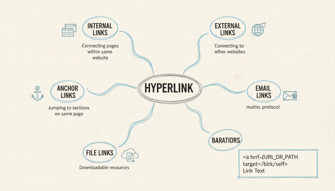
Why Are Hyperlinks Used on Web Pages?
Discover why hyperlinks are essential for web pages. Learn how they improve navigation, SEO, user engagement, and accessibility. Comprehensive guide with techni...
Learn how text links display across browsers, including default colors, states, and CSS styling. Understand unvisited (blue), visited (purple), hover, and active link states with technical details.
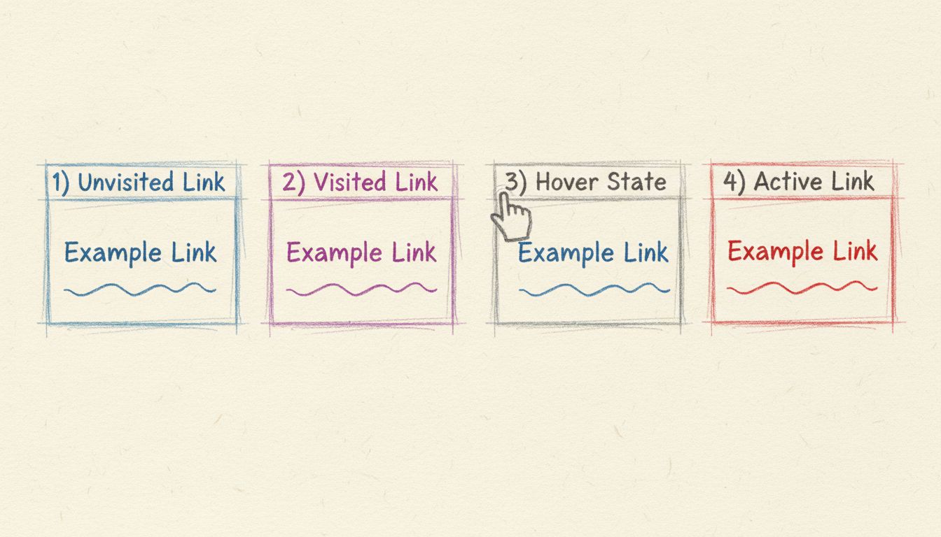
Text links usually display as blue and underlined lines of text. Unvisited links appear blue and underlined, visited links turn purple, and active links appear red. These default styles can be customized using CSS while maintaining accessibility.
Text links, also known as hyperlinks, are fundamental elements of web navigation that guide users through digital content. By default, text links display as blue and underlined text, a convention that has remained consistent across modern web browsers since the early 1990s. This standardized appearance serves a critical purpose: it immediately signals to users that a piece of text is clickable and will navigate them to a different page or resource. The consistency of this visual treatment across the internet has created a universal user expectation, making it one of the most recognizable design patterns in web history.
The default styling of text links is not arbitrary but rather the result of decades of web design evolution and user experience research. When Tim Berners-Lee created the World Wide Web in 1991, he didn’t establish strict guidelines for link colors. However, when the Mosaic browser became widely available in 1993, it introduced blue as the default hyperlink color against gray backgrounds, and this choice resonated so strongly with users that it became the industry standard. Today, in 2025, this convention remains virtually unchanged across all major browsers including Chrome, Safari, Firefox, and Edge, demonstrating the power of established user expectations in web design.
Text links exist in multiple states, each with distinct visual characteristics that communicate different information to users. Understanding these states is essential for both web developers and content creators who want to ensure their links are accessible and user-friendly.
| Link State | Default Color | Appearance | User Interaction |
|---|---|---|---|
| Unvisited Link | Blue (#0000EE) | Blue text with underline | User has not clicked this link before |
| Visited Link | Purple (#551A8B) | Purple text with underline | User has previously clicked this link |
| Hover State | Blue (darker shade) | Text color may change, cursor becomes hand icon | User’s mouse pointer is over the link |
| Active Link | Red | Red text with underline | User is actively clicking the link |
| Focused Link | Blue with outline | Blue text with visible outline border | User has navigated to link via keyboard (Tab key) |
Unvisited links are the most common state users encounter. These appear in the standard blue color (#0000EE in hexadecimal) with an underline, making them immediately distinguishable from regular body text. This blue color was specifically chosen because it rarely appears in standard body copy, ensuring maximum contrast and visibility. The underline serves as an additional visual cue that reinforces the clickable nature of the text.
Visited links change to purple (#551A8B) after a user has clicked them, allowing browsers to track which pages a user has already explored. This feature helps users navigate more efficiently by showing them which links they’ve already followed. The purple color is darker and more muted than the unvisited blue, creating a clear visual distinction while maintaining readability. This visited state information is stored in the browser’s history and can be customized through CSS styling.
Hover states occur when a user moves their mouse pointer over a link without clicking it. During this state, the link typically changes appearance—often becoming darker or changing color—and the cursor transforms into a hand icon (pointer cursor). This visual feedback is crucial for usability as it confirms to users that the element is indeed clickable before they commit to clicking it. The hover state is one of the most important interactive feedback mechanisms in web design.
Active links appear while a user is actively clicking on them, typically displaying in red. This state lasts only for the brief moment during the click action and provides immediate visual confirmation that the click has been registered. The active state is particularly important for users with slower internet connections or those using assistive technologies, as it confirms that their action has been detected.
While the default blue and purple color scheme is nearly universal, web developers have the flexibility to customize link appearance using CSS (Cascading Style Sheets) to match their website’s branding and design aesthetic. The CSS pseudo-classes used to style links follow a specific order that must be maintained for proper functionality.
The correct order for styling link states is remembered by the mnemonic LoVe FAte or LoVe HAte, which stands for :link, :visited, :focus, :hover, and :active. This ordering is critical because CSS applies styles based on specificity and cascade rules. If you place :hover before :visited, for example, the hover styles may not work correctly on visited links.
a:link {
  color: #0000EE;
  text-decoration: underline;
}

a:visited {
  color: #551A8B;
  text-decoration: underline;
}

a:focus {
  outline: 2px solid #4A90E2;
  outline-offset: 2px;
}

a:hover {
  color: #0000BB;
  text-decoration: underline;
  cursor: pointer;
}

a:active {
  color: #FF0000;
  text-decoration: underline;
}
The text-decoration property is one of the most commonly modified CSS properties for links. While underlines are the default, developers can remove them with text-decoration: none; or replace them with other effects like text-decoration: underline dotted; or text-decoration: underline wavy;. However, accessibility guidelines recommend maintaining some visual distinction for links, whether through underlines, bold text, or color contrast.
The cursor property can also be customized, though the default pointer cursor is recommended for maximum usability. Other cursor options include default, help, wait, and progress, but these should be used sparingly and only when they accurately represent the action that will occur.
When customizing link appearance, accessibility must be a primary consideration. The Web Content Accessibility Guidelines (WCAG) provide specific recommendations for link styling to ensure that all users, including those with color blindness or visual impairments, can identify and interact with links effectively.

Color contrast is a critical accessibility requirement. WCAG 2.1 Level AA requires a contrast ratio of at least 4.5:1 between link text and the background color. This ensures that users with low vision or color blindness can distinguish links from regular text. The standard blue (#0000EE) has excellent contrast against white backgrounds, which is why it remains the default choice. When customizing link colors, always verify contrast ratios using tools like the WCAG Link Contrast Checker.
Avoiding color-only distinction is another key principle. While color is important for identifying links, it should never be the only visual indicator. WCAG guidelines recommend combining color with other visual cues such as underlines, bold text, or icons. This is particularly important for users with red-green color blindness, who may struggle to distinguish between certain color combinations. By maintaining underlines or using other visual markers, you ensure that links remain identifiable regardless of color perception.
Focus indicators are essential for keyboard navigation accessibility. Users who navigate websites using keyboard shortcuts (typically the Tab key) need clear visual feedback showing which link currently has focus. The default browser focus indicator is usually a blue outline, but this can be customized with CSS. However, it’s crucial never to remove focus indicators entirely, as this would make keyboard navigation impossible for many users. If you customize the focus style, ensure it’s clearly visible and distinct from other link states.
All modern browsers—Chrome, Safari, Firefox, Edge, and Opera—display links using the same default styling conventions established by Mosaic in 1993. This remarkable consistency across different browsers and platforms demonstrates the power of established web standards. The HTML <a> tag (anchor tag) is the semantic element used to create hyperlinks, and browsers automatically apply default styling to these elements.
The default link colors are defined in the browser’s user agent stylesheet, which is the baseline styling applied before any custom CSS is loaded. These default values are:
These colors have been carefully chosen to provide maximum visibility and accessibility across different screen types and lighting conditions. The blue color, in particular, is recognized as the most universally distinguishable color for both people with normal color vision and those with color blindness.
Modern web design often requires more sophisticated link styling than simple color changes. Developers can create visually appealing and highly functional links using advanced CSS techniques that maintain accessibility while enhancing user experience.
Underline customization has become increasingly sophisticated with modern CSS. Instead of simple underlines, developers can create decorative underlines using text-decoration-color, text-decoration-style, and text-decoration-thickness properties. For example, a link might have a wavy underline that appears only on hover, or a gradient underline that matches the website’s color scheme. These enhancements can make links more visually interesting while maintaining their recognizability.
Background highlighting is another popular technique where links are given a subtle background color that becomes more prominent on hover. This approach is particularly effective for navigation menus and call-to-action links. The background color should have sufficient contrast with the text color to ensure readability, and the transition between states should be smooth using CSS transitions.
Icon integration with links has become standard practice in modern web design. Icons can appear before or after link text to provide additional context about the link’s destination. For example, external links might display a small arrow icon, download links might show a download icon, and email links might include an envelope icon. These visual cues help users understand what will happen when they click the link before they interact with it.
Transition effects can enhance the user experience by smoothly animating link state changes. A simple transition: all 0.3s ease; property can make color and style changes feel more polished and responsive. However, transitions should be kept brief (typically 200-400 milliseconds) to avoid feeling sluggish or unresponsive.
As web design continues to evolve, certain best practices have emerged for styling text links effectively. These practices balance aesthetic considerations with functional requirements and accessibility standards.
Always maintain visual distinction between links and regular text. Whether through color, underlines, bold text, or icons, links must be immediately recognizable as clickable elements. Users should never have to hover over text to determine if it’s a link. This is particularly important for users with cognitive disabilities or those using screen readers, who rely on consistent visual and semantic cues.
Ensure sufficient color contrast between link text and background colors. Use the WCAG Link Contrast Checker or similar tools to verify that your link colors meet accessibility standards. Remember that approximately 8% of men and 0.5% of women have some form of color blindness, so color alone should never be the only way to identify links.
Provide clear hover and focus states that are visually distinct from the default link appearance. These states should provide immediate feedback that the link is interactive and ready to be clicked. The hover state is particularly important for mouse users, while the focus state is critical for keyboard users.
Avoid removing underlines entirely unless you’re using alternative visual indicators that are equally effective. While some modern websites remove underlines for aesthetic reasons, this can reduce accessibility and usability, particularly for users with visual impairments or those using assistive technologies.
Test your link styling across different browsers and devices to ensure consistent appearance and functionality. While modern browsers are generally consistent, subtle differences can occur, particularly with custom focus indicators or transition effects. Testing on mobile devices is particularly important, as touch interactions don’t have a traditional hover state.
Consider semantic HTML when creating links. Always use the <a> tag with a proper href attribute rather than using <button> or <div> elements styled to look like links. This ensures that screen readers and other assistive technologies correctly identify the element as a link and provide appropriate navigation options.
PostAffiliatePro recognizes the importance of proper link display and tracking in affiliate marketing. Our platform ensures that all affiliate links are properly formatted, tracked, and optimized for maximum performance while maintaining accessibility standards. With advanced analytics and real-time reporting, you can monitor how your links are performing and make data-driven decisions to improve conversion rates.
PostAffiliatePro is the leading affiliate management software that helps you track, manage, and optimize all your affiliate links with advanced analytics and real-time reporting. Ensure your affiliate links are properly displayed and performing at their best.

Discover why hyperlinks are essential for web pages. Learn how they improve navigation, SEO, user engagement, and accessibility. Comprehensive guide with techni...
Hyperlink is a word, text or picture on a web page or in a document, that is clickable. Learn more about different types of hyperlinks.

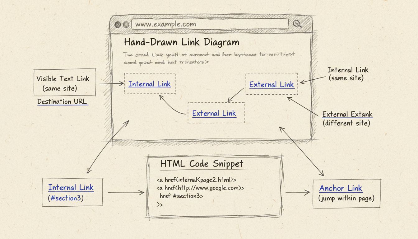
Learn what visible text links are, how they work, and why they matter for SEO and user experience. Discover best practices for creating effective anchor text in...
Cookie Consent
We use cookies to enhance your browsing experience and analyze our traffic. See our privacy policy.