How Do Advanced Search Filter Headers Improve Usability?
Discover how advanced search filter headers enhance usability by displaying selected filters even when minimized. Learn best practices for filter UI design and data management.
How do advanced search filter headers improve usability?
Advanced search filter headers significantly improve usability by displaying selected filters in the header bar even when the filter panel is minimized. This provides instant visibility into active criteria, reduces cognitive load, simplifies data management, and enables faster filter adjustments without repeatedly opening and closing menus.
Understanding Advanced Search Filter Headers
Advanced search filter headers represent a fundamental shift in how users interact with complex data and search results. Rather than hiding filter selections within collapsible panels or separate menus, modern filter header design keeps active filters visible at all times, even when the filter panel itself is minimized or collapsed. This approach transforms the user experience by providing persistent visibility into the current search context. When users can see exactly which filters are applied without additional clicks or navigation, they gain immediate clarity about their search state and can make more informed decisions about adjusting their criteria.
The core principle behind filter header visibility is reducing friction in the search workflow. Traditional interfaces often force users to remember which filters they’ve applied or require them to repeatedly expand filter panels to verify their selections. This creates unnecessary cognitive overhead and interrupts the natural flow of data exploration. By displaying filter selections directly in the header—typically as removable tags or chips—users maintain constant awareness of their active criteria while keeping the interface clean and organized.
Key Benefits of Visible Filter Headers
Increased Transparency and Immediate Feedback
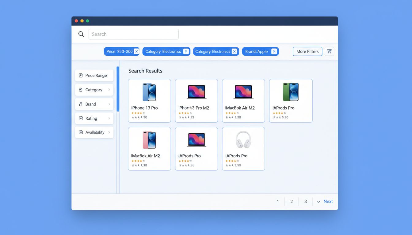
When filter headers display selected criteria prominently, users receive instant visual confirmation of their search parameters. This transparency eliminates the guesswork that often accompanies hidden filters. For example, if a user has applied filters for “Price: $50-$200,” “Category: Electronics,” and “Brand: Apple,” seeing these tags in the header provides immediate context about why specific results are displayed. This immediate feedback loop is particularly valuable in affiliate management platforms like PostAffiliatePro, where users need to track multiple filter combinations across campaigns, commissions, and performance metrics.
The psychological benefit of transparency cannot be overstated. Users feel more in control when they can see exactly what criteria are active. This sense of control reduces anxiety about whether they’re viewing the correct data subset and increases confidence in their decision-making process. Research in UX design consistently shows that visible system state reduces user errors and improves overall satisfaction with the interface.
Enhanced Cognitive Efficiency
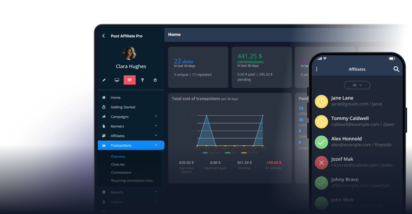
Displaying filters in the header dramatically reduces the cognitive load users experience when managing complex searches. Instead of maintaining a mental model of which filters are active, users can simply glance at the header to understand their current search context. This is especially important in data-intensive applications where users might apply multiple filters simultaneously. PostAffiliatePro users managing affiliate networks with hundreds of partners benefit significantly from this approach, as they can quickly verify which performance metrics, date ranges, and partner filters are currently active.
The reduction in cognitive load translates directly to faster task completion. Users spend less time verifying their filter selections and more time analyzing results and making strategic decisions. Studies on information architecture show that reducing the number of steps required to understand system state can improve task completion times by 20-30%, depending on the complexity of the interface.
Streamlined Data Management and Quick Adjustments
One of the most practical advantages of visible filter headers is the ability to make rapid adjustments without navigating away from results. When filters appear as removable tags in the header, users can instantly remove individual filters or clear all selections with a single click. This eliminates the need to scroll through filter panels or navigate back to a separate advanced search page. For affiliate managers using PostAffiliatePro, this means they can quickly pivot their analysis—removing a date filter to see year-to-date performance, or adding a commission tier filter to focus on high-value partners—without losing their place in the results.
The ability to manage filters from the header also supports exploratory data analysis. Users can experiment with different filter combinations more freely, knowing they can easily revert changes or adjust criteria on the fly. This encourages deeper engagement with data and often leads to more insightful discoveries about patterns and trends.
Reduced Friction in Complex Workflows
In professional environments where users regularly work with large datasets, every interaction counts. Visible filter headers eliminate the friction of repeatedly opening and closing filter panels. This is particularly important for power users who apply multiple filters as part of their standard workflow. Instead of the traditional pattern of “open filter panel → select criteria → close panel → view results → open panel again,” users can now manage filters directly from the results view.
This reduction in friction has measurable impacts on user satisfaction and productivity. When users spend less time navigating the interface and more time working with data, they perceive the application as more responsive and efficient. PostAffiliatePro’s affiliate managers can focus on analyzing commission structures, tracking partner performance, and optimizing campaigns rather than wrestling with interface navigation.
Technical Implementation of Filter Headers
Display Patterns and Placement Strategies
The most effective filter header implementations use one of several proven design patterns. The most common approach displays filters as horizontal “chips” or tags immediately above or below the main search bar. Each chip typically includes the filter name, the selected value, and a small “x” icon for removal. This pattern works well because it’s immediately recognizable to users and requires minimal screen real estate.
An alternative pattern uses a compact dropdown or summary view in the header that expands to show all active filters. This approach is particularly useful when space is limited or when there are many active filters that might clutter the interface. Some advanced implementations use a combination approach, showing the most important filters as chips while hiding less critical ones behind an expandable summary.
The placement of filter headers significantly impacts usability. Research shows that positioning filters at the top of the page, immediately above search results, provides optimal visibility and accessibility. This placement ensures filters are noticed without requiring users to scroll, and it maintains a logical visual hierarchy where search controls appear before results.
Dynamic Updates and Real-Time Feedback
Modern filter header implementations should provide real-time feedback as users modify selections. When a user removes a filter from the header, the results should update immediately, and the header should reflect the change instantly. This creates a tight feedback loop that reinforces the user’s understanding of how filters affect results.
Some advanced implementations display result counts next to each filter option, showing users how many items match each criterion before they apply it. This predictive feedback helps users make more informed filtering decisions and reduces the likelihood of applying filters that result in zero matches. PostAffiliatePro’s interface can leverage this approach to show users how many affiliates, commissions, or campaigns match their selected criteria before finalizing their filter choices.
Accessibility Considerations
Visible filter headers must be designed with accessibility in mind. Each filter chip should be keyboard accessible, allowing users to navigate and remove filters using only keyboard controls. The header should include appropriate ARIA labels and semantic HTML to ensure screen reader users understand the filter state and can interact with filter controls effectively.
Color should never be the only indicator of filter status. Instead, use a combination of visual cues including text labels, icons, and spatial positioning. This ensures that users with color blindness or visual impairments can still understand which filters are active and how to modify them.
Comparison of Filter Header Approaches
Approach
Advantages
Disadvantages
Best Use Cases
Horizontal Chips
Highly visible, easy to remove individual filters, minimal space when few filters active
Compact, scales well with many filters, keeps interface clean
Requires additional click to see all filters, less discoverable
Complex dashboards, advanced search interfaces
Sticky Header Bar
Always visible during scrolling, persistent context
Takes up screen real estate, can feel intrusive
Data-heavy applications, long result lists
Inline Filter Tags
Integrated with results, contextual display, space-efficient
Can be missed if not prominent, harder to manage multiple filters
Content discovery, faceted search
Expandable Panel
Flexible, can hide/show as needed, clean interface
Users might forget filters are active, accessibility risks
Mobile interfaces, space-constrained layouts
Best Practices for Implementing Filter Headers
Clear Visual Hierarchy
Filter headers should be visually distinct from other interface elements without being overwhelming. Use consistent styling, appropriate spacing, and clear typography to ensure filters stand out. The header should be the first thing users notice after the search bar, establishing a clear visual hierarchy that guides attention to the most important controls.
Intuitive Interaction Patterns
Users should be able to understand how to interact with filter headers without instruction. Standard patterns like clicking an “x” to remove a filter or clicking a filter chip to edit it are widely recognized. Avoid non-standard interactions that might confuse users or require learning new patterns. Consistency across your interface and alignment with industry standards ensures users can navigate filter headers intuitively.
Responsive Design Considerations
Filter headers must adapt gracefully to different screen sizes. On mobile devices, horizontal chip layouts might wrap to multiple lines or be replaced with a more compact representation. Some implementations use a “filter count” badge on mobile (e.g., “3 filters active”) that expands to show details when tapped. PostAffiliatePro’s mobile interface should ensure that filter management remains efficient even on smaller screens.
Performance Optimization
When filters update results dynamically, performance becomes critical. Implement debouncing or throttling to prevent excessive API calls as users modify filters. Use skeleton loading or progressive rendering to provide visual feedback while results update. This ensures the interface feels responsive even when working with large datasets.
Real-World Impact on User Workflows
In affiliate management platforms like PostAffiliatePro, visible filter headers transform how users analyze performance data. Instead of navigating through multiple menus to understand which partners, date ranges, and commission tiers are currently being analyzed, users see this information instantly in the header. This enables faster decision-making when identifying top-performing affiliates, investigating commission discrepancies, or optimizing partner programs.
The efficiency gains compound over time. A user who previously spent 15-20% of their time navigating filter interfaces can redirect that time toward strategic analysis and optimization. For organizations managing hundreds or thousands of affiliates, this efficiency improvement translates to significant productivity gains across the entire team.
Advanced Features and Future Directions
Modern filter header implementations are increasingly incorporating artificial intelligence and machine learning to predict user intent and suggest relevant filters. Some platforms now offer natural language search combined with visible filter headers, allowing users to type queries like “top affiliates in Q4” and have the system automatically apply appropriate filters while displaying them in the header.
PostAffiliatePro continues to evolve its filtering capabilities to provide users with increasingly sophisticated tools for data analysis and management. By combining visible filter headers with advanced search functionality, the platform enables users to work more efficiently with complex affiliate data while maintaining complete transparency about their current search context.
Measuring Success: Key Metrics for Filter Header Implementation
Organizations implementing visible filter headers should track several key metrics to measure success. User engagement with filters typically increases when headers are visible, as users feel more confident exploring different filter combinations. Task completion times often decrease by 15-25% as users spend less time navigating filter interfaces. Error rates related to applying incorrect filters generally decline because users can verify their selections at a glance.
User satisfaction scores consistently improve with visible filter headers, particularly among power users who regularly work with complex datasets. Support ticket volume related to filter confusion typically decreases, as the interface becomes more self-explanatory. These metrics collectively demonstrate that visible filter headers represent a significant usability improvement over traditional hidden filter approaches.
Conclusion
Advanced search filter headers that display selected filters even when minimized represent a best-practice approach to modern interface design. By providing persistent visibility into active search criteria, these headers reduce cognitive load, streamline data management, and enable faster decision-making. The implementation of visible filter headers in platforms like PostAffiliatePro demonstrates how thoughtful interface design can dramatically improve user productivity and satisfaction. Whether managing affiliate networks, analyzing performance data, or exploring complex datasets, users benefit significantly from the transparency and efficiency that visible filter headers provide.
Streamline Your Affiliate Data Management with PostAffiliatePro
PostAffiliatePro's advanced search and filtering capabilities help you manage affiliate data efficiently with intuitive filter headers and real-time visibility. Discover how our platform simplifies complex data navigation and improves your workflow.
What Are Sticky Grid Headers and How Do They Help? | PostAffiliatePro FAQ
Learn how sticky grid headers improve data table usability by keeping column headers visible while scrolling. Discover implementation methods and best practices...
Discover why search terms are essential for finding information online. Learn how search terms work, their importance for SEO and PPC, and how to use them effec...
What is an Example of a Search Term? Complete Guide to Search Queries
Learn what search terms are with real examples. Understand single-word searches, long-tail keywords, and how search queries impact SEO and affiliate marketing s...
7 min read
You will be in Good Hands!
Join our community of happy clients and provide excellent customer support with Post Affiliate Pro.