
Improve Your Chances of Being Accepted by Affiliate Networks
proven strategies to increase your affiliate program approval rate. what networks look for, how to build authority, and actionable tips to get accepted faster.
7 min read
Learn how to build a premium website that converts visitors into customers. Discover design psychology, UX principles, and proven strategies for affiliate marketers to create high-performing websites.
Creating a premium website isn’t just about aesthetics—it’s about building a digital asset that earns trust, guides visitors naturally toward conversion, and generates consistent revenue. For affiliate marketers, a premium website is the difference between a side project and a sustainable business. This comprehensive guide reveals the psychology, design principles, and practical strategies that separate high-performing affiliate sites from forgettable ones.
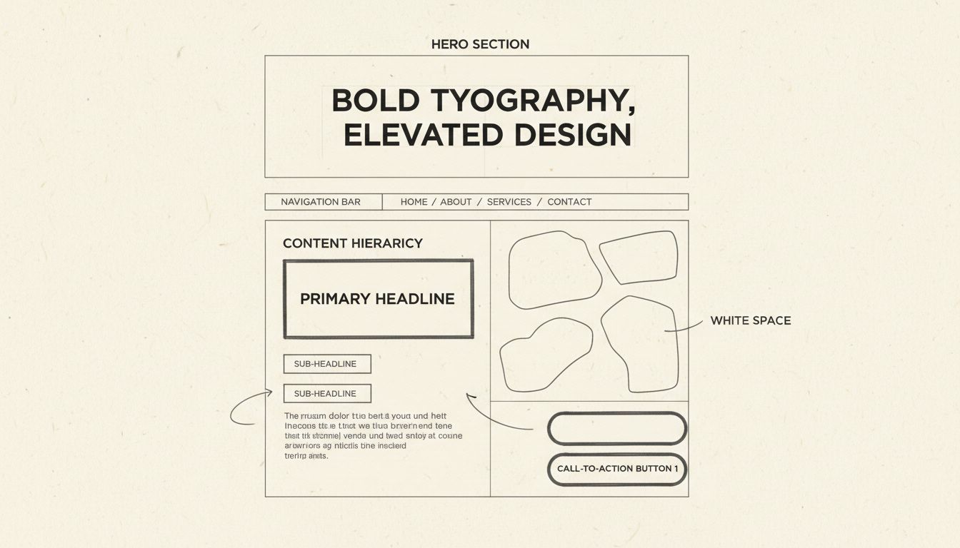
A premium website operates on three psychological principles that separate it from ordinary sites. First, the halo effect means users form an opinion about your entire business within milliseconds of landing on your site. That snap judgment is governed by visual polish, typography quality, and overall design coherence. If the first impression doesn’t earn trust, nothing below the fold will get read. This is why the hero section—everything visible before scrolling—deserves obsessive attention.
Second, cognitive load and cognitive fluency determine whether users feel calm or stressed. A confusing, cluttered website creates high cognitive load, making users feel overwhelmed and causing them to leave. A clean, intuitive website creates cognitive fluency—the brain interprets this ease as a signal of trustworthiness and quality. Premium websites achieve cognitive fluency through generous white space, clear visual hierarchy, and simple navigation that never makes users think about where to go. Every element on the page should either earn its place or be removed.
Third, the peak-end rule explains why micro-interactions matter. People don’t remember experiences in their entirety—they remember the most intense moments and how it ended. Small, thoughtful animations like a button shifting color on hover, a form field responding on focus, or a page transition that feels smooth create peaks of positive emotion. These moments signal craft and care. Over the course of a session, these micro-interactions accumulate into an overall impression of quality that users remember long after they leave.
Set up advanced tracking in minutes. No credit card required.
The old rule valued professionalism through minimalism and restraint. That default no longer differentiates. In 2026, websites must stand out through what designers call tactile maximalism—rich textures, vibrant color, and editorial, magazine-like layouts that create a memorable experience from the first scroll. Minimalism isn’t dead, but invisible isn’t an option anymore.
The brands winning attention right now are the ones that feel like something—a distinct point of view expressed through layout, color, typography, and pacing. Generic templates and safe corporate aesthetics blend into background noise. Your website should reflect your brand’s unique perspective. This doesn’t mean chaotic design; it means intentional choices that communicate who you are and why you matter. For affiliate marketers, this personality builds trust and differentiates you from competitors covering the same products.
Animations are no longer gimmicks—they’re functional communication tools. The shift is toward subtle animations and micro-interactions that guide users, provide real-time feedback, and make the experience feel intuitive rather than static. When done well, motion transforms a flat page into something dynamic, responsive, and alive.
The test is simple: does the animation serve the user, or does it serve the designer’s ego? Scroll-triggered reveals that show content as users scroll, hover state transitions that confirm interactivity, and loading animations that maintain engagement all contribute to a website that feels responsive and thoughtfully built. But motion for motion’s sake—autoplay videos, aggressive parallax effects, or animations that delay access to content—works against the user and damages your credibility.
AI is a legitimate accelerant for design work—generating color palettes, suggesting font pairings, auditing for accessibility gaps, and even helping structure content. What it can’t do is understand your brand’s audience, goals, or emotional positioning at a strategic level. The right posture is AI as a partner, not a replacement for design thinking.
Use AI to go faster. Don’t use it to skip the thinking. The teams producing the best work in 2026 are using AI to handle the repetitive, time-consuming parts of the design process while investing their human energy in strategy, storytelling, and creative direction—the work that requires genuine understanding of your audience. For affiliate marketers, this means using AI to generate initial site structures and content outlines, but applying your expertise to ensure the final product reflects your unique perspective and serves your specific audience.
Accessibility has moved from afterthought to foundation. High-contrast color schemes, legible fonts, and proper heading structures aren’t edge case considerations—they are the baseline of good design. The practical upside: designing for users with disabilities improves the experience for everyone. Keyboard navigation, screen reader compatibility, sufficient color contrast ratios (minimum 4.5:1 for regular text), and clear focus states are not features—they are minimum standards.
Websites that skip these basics are communicating something about the company behind them, whether they intend to or not. According to the 2025 WebAIM Million report, 94.8% of the top one million home pages contain at least one detectable WCAG 2 A/AA failure, and low-contrast text appears on 79.1% of home pages. This represents a massive opportunity for affiliate marketers to differentiate by building accessible sites that work for everyone.
Designing for a fixed screen size is obsolete. Websites must perform seamlessly across every device and context. Beyond responsive layouts, the next frontier is hyperpersonalization—delivering different experiences based on whether someone is a first-time visitor or a returning customer, the time of day, or their geographic location. A website that adapts to the user feels intentional and intelligent. The experience should change. The quality should not.
Building a premium website requires mastering eleven core design elements that work together to create trust and drive conversions. These aren’t theoretical concepts—they’re practical, measurable components that directly impact your bottom line.
Strong web design starts with knowing who you’re designing for. If you don’t understand your audience, every choice from layout to messaging risks missing the mark. Customer needs shift over time, and design must keep pace. Salesforce reports that 65% of customers expect companies to adapt to their changing needs and preferences. A site that feels outdated or out of touch signals that the business isn’t paying attention.
Creating user personas—fictional customer profiles that summarize goals, challenges, and decision-making patterns—turns research into actionable insights. For affiliate marketers, this means understanding not just what products your audience wants, but why they want them, what objections they have, and what proof they need to move forward. Different audience segments may need different messaging, layouts, or comparison approaches.
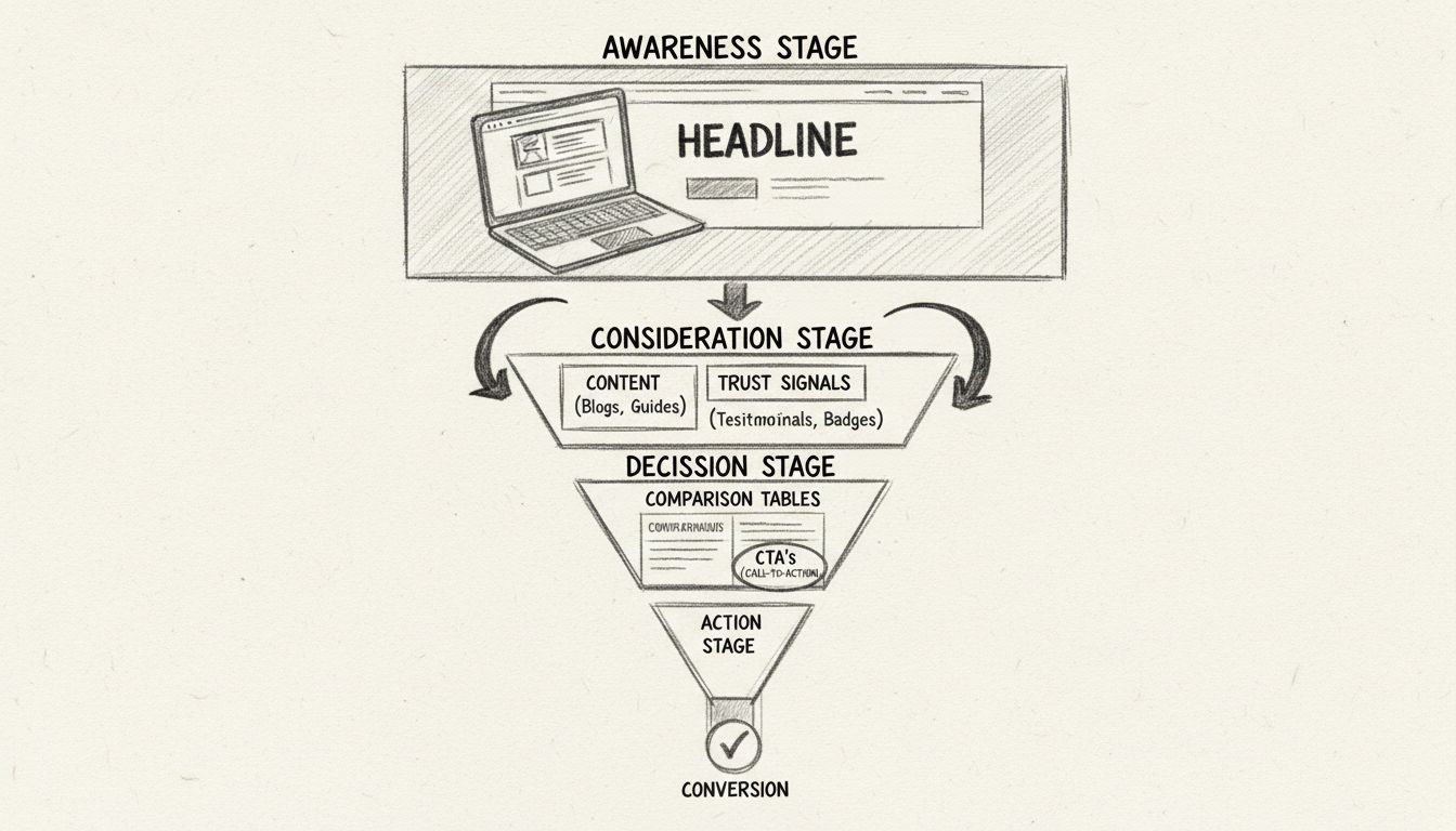
Even the best design falls flat if the message is confusing. Visitors should understand within seconds what you do, who you serve, and why it matters. If they can’t answer those questions quickly, they will move on. Clear brand messaging means stripping out the fluff and focusing on what the user cares about most. As the saying goes, clarity over clever. Effective messaging isn’t about witty wordplay; it’s about making the basics clear.
This usually comes down to three elements: the problem you solve, the benefit of choosing your business, and the action you want them to take next. Simple, direct language is always stronger than clever phrasing that leaves people guessing. Reinforcing that message with proof points like testimonials, case studies, or reviews adds credibility. When visitors see a message that addresses their needs and supports it with evidence, they’re far more likely to take the next step.
Every page on a website should exist for a reason. If a page doesn’t have a clear purpose, it risks distracting visitors instead of helping them. A defined purpose answers a simple question: What do we want someone to do here? That might involve filling out a form, reading a case study, or taking a step toward a purchase. Without that clarity, visitors are left wandering without direction.
When reviewing a page, ask yourself: What is the primary goal of this page? Does every element support that goal? Is the next step obvious to the visitor? Pages with a clear purpose feel more intentional and are easier to navigate. Visitors don’t waste time guessing what comes next. Instead, the design points them toward a specific action that supports both their needs and your business goal.
The order in which information appears shapes how people interpret its importance. Content placed at the top of the page gets the most attention, but hierarchy doesn’t stop above the fold. As users scroll, what they see first on each section signals priority. A strong content hierarchy helps people process information quickly and stay oriented.
A strong content hierarchy follows three simple priorities: Lead with what matters most by placing core value propositions and key benefits early. Layer supporting details further down using the middle of the page for context, proof points, or examples. Place conversion triggers strategically by positioning calls to action, forms, or offers at natural decision points throughout the scroll. When hierarchy is intentional, users can skim the page without losing the thread. Each scroll reinforces the journey, showing them what matters now and what comes next.
A cluttered page makes it harder for visitors to know where to look and what to do. Too many competing elements—multiple fonts, overlapping visuals, walls of text, excessive animations—create confusion instead of clarity. A clean layout helps direct attention where it matters most. That doesn’t mean stripping the page bare. It means being intentional with what stays and what goes.
Key practices for clutter-free design include: Use whitespace strategically to separate sections and give content room to breathe. Limit competing visuals so every image or graphic has a clear role in supporting the message. Keep choices simple because too many options at once often leads to inaction. When layouts are free of clutter, users spend less time figuring out the page and more time engaging with the content and calls to action.
Images carry weight. They’re often noticed before text, and they strongly influence how trustworthy a site feels. Stock photos and generic graphics may fill space, but they rarely build confidence. In some cases, they even send the wrong signal by making a business look impersonal or outdated. Authentic visuals, on the other hand, connect directly with the audience.
This can mean: Original photography showing your team, your office, or your product in use helps people see who they’re doing business with. Contextual imagery that supports the surrounding content instead of distracting from it—for example, a service page showing the process in action rather than a generic handshake photo. Consistent style where visuals match your brand identity and tone, from color palette to composition. As audiences encounter more AI-generated visuals online, they’re quicker to notice when something feels inauthentic. A survey by Stackla found that 88% of consumers say authenticity is a key factor in deciding which brands they support.
Clear calls to action (CTAs) provide visitors with a clear path forward. Without them, even an interested user can stall because the next step isn’t obvious. Strong CTAs have a few things in common: Direct language using plain words like “Book a demo,” “Start your free trial,” or “Get in touch.” Avoid vague phrases like “Learn more” that don’t signal what will happen next. Visual contrast so buttons and links stand out from the rest of the page without clashing with the design. Strategic placement at natural decision points—a single button at the bottom of a long page is easy to miss, but repeating the same action in a few key spots keeps it visible without overwhelming the reader.
The best CTAs feel like a natural part of the journey. They show up at the right time, in the right place, with the right message. That clarity turns attention into action.
A website should work for everyone. If people struggle to read text, navigate menus, or interact with features, the experience quickly breaks down. Accessibility is not just about compliance. It’s about respect for the audience and creating a site that anyone can use with ease. Practical ways to make content accessible and clear include: Readable text with fonts and sizes that are easy to scan and sufficient color contrast for users with vision impairments. Descriptive labels with alt text for images, clear labels for form fields, and descriptive link text that clearly indicates what to expect. Consistent navigation that’s simple, predictable, and structured so users always know where they are and how to move forward.
When accessibility and clarity are prioritized, the site becomes easier to use for everyone, not just those with specific needs. This creates a smoother experience and shows that the business values every visitor.
More than half of all web traffic now comes from mobile devices. If a site doesn’t work well on a phone, it risks losing a significant portion of its audience before they ever see what the business offers. Mobile design can no longer be treated as an afterthought. A mobile-first approach means building the experience for smaller screens first, then scaling up for desktop. This ensures the essentials work where users are most likely to visit.
Key practices for mobile-first design include: Simplified navigation with menus that are easy to tap and use with one hand. Thumb-friendly buttons where CTAs, links, and form fields are large enough to press without zooming in. Responsive layouts where content resizes and rearranges smoothly across different devices. Fast performance since mobile users often rely on slower connections, making page weight and load times even more critical. When a site feels seamless on mobile, it creates confidence and convenience. Visitors are more likely to stay, explore, and convert, regardless of their location.
A slow website can deter a user, even from the best design choices. When page load time increases from one second to three seconds, the likelihood of a bounce jumps by 32%. That makes performance one of the most crucial aspects of the user experience. Speed is not just about convenience. It directly affects trust, search visibility, and conversions—your bottom line. A sluggish site signals neglect, while a fast site conveys reliability and professionalism.
Improving performance often comes down to a few focused steps: Optimize images by compressing large files and using modern formats like WebP to maintain quality without slowing down load times. Limit scripts and plugins since every extra tool adds weight—keep only what’s essential. Use efficient code where clean, streamlined code reduces the time it takes for pages to render. Leverage caching and CDNs where caching stores resources locally for repeat visitors, and CDNs deliver content from servers closer to the user. A site that loads quickly feels effortless to use. It keeps people engaged, improves SEO, and creates a stronger path toward conversion. In many cases, performance is the difference between a site that earns attention and one that fails to do so.
A website is never truly finished. User behavior changes, technology evolves, and expectations shift. What works today may not work tomorrow, which is why ongoing testing is essential. Small experiments can reveal big insights. A different headline, a new call-to-action placement, or an updated layout might have a measurable impact on conversions.
Tools like heatmaps and session recordings reveal how people navigate a site, highlighting where they encounter difficulties or drop off. Analytics confirm what’s working and what needs to change. This process of testing and refinement is at the heart of effective web design. A site that adapts to user feedback not only stays relevant but also continues to create smoother experiences and stronger results over time. Tested and refined consistently, a site becomes more than a digital brochure. It turns into a living tool that grows with the audience and consistently drives results.
Be the first to know about new features and product updates.
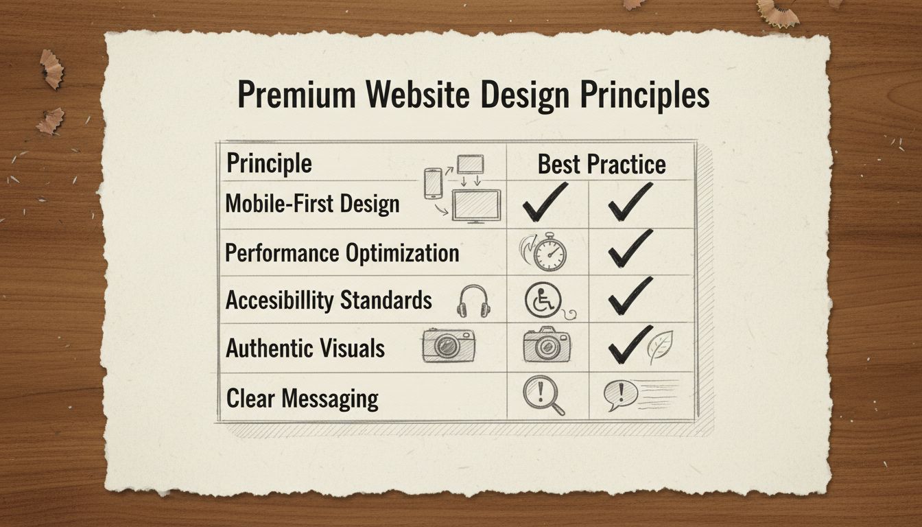
| Design Element | Premium Approach | Common Mistakes | Impact on Conversions |
|---|---|---|---|
| Hero Section | Bold, authentic imagery with clear value proposition | Generic stock photos, unclear messaging | 40-60% of first impressions |
| Navigation | Simple, intuitive, sticky header for easy access | Cluttered menus, hidden navigation | Directly affects bounce rate |
| Typography | Consistent, readable fonts with clear hierarchy | Too many font families, poor contrast | 75% of credibility judgments |
| White Space | Generous spacing between elements | Cramped layouts, information overload | Reduces cognitive load by 30% |
| Color Scheme | Intentional palette reflecting brand personality | Random colors, poor contrast ratios | Influences 85% of purchasing decisions |
| Call-to-Action | Clear, contrasting buttons with direct language | Vague text, poor placement, low contrast | Directly impacts conversion rate |
| Images | Authentic, contextual, high-quality visuals | Stock photos, irrelevant graphics | Increases engagement by 80% |
| Page Speed | Under 2.5 seconds LCP, optimized assets | Unoptimized images, excessive scripts | 63% abandon after 3 seconds |
| Mobile Design | Responsive, thumb-friendly, fast loading | Desktop-only design, slow mobile | 57-59% of traffic is mobile |
| Accessibility | WCAG AA compliant, keyboard navigation | Low contrast, missing alt text | Reaches 15% of population |
| Trust Signals | Testimonials, credentials, security badges | No social proof, unclear credentials | Increases trust by 72% |
The website design landscape in 2026 is shaped by several powerful trends that separate premium sites from ordinary ones. Understanding and implementing these trends strategically can significantly enhance your affiliate website’s performance.
AI-Powered Personalization allows websites to adapt in real time based on visitor behavior. AI analyzes what users click, how long they stay, and where they came from, then adjusts the interface accordingly. A returning customer might see different hero content than a first-time visitor. Product recommendations surface based on browsing history rather than generic bestseller lists. For affiliate marketers, this means showing different products or comparison angles to different audience segments automatically.
Kinetic Typography uses animated text that transforms and responds to users. Variable fonts, animated text, and responsive kinetic type anchor hero sections and product pages. Text becomes a visual focal point rather than a supporting element. Letters scale, rotate, or transform as users scroll through scroll-triggered animations. Headlines respond to cursor movement. Words reveal themselves through choreographed animations that guide attention exactly where you want it. This works powerfully in hero sections and key messaging areas but should be avoided for body copy where readability matters more.
Micro-Interactions and Motion Design provide subtle feedback that guides users through their experience. A button that subtly shifts when hovered confirms interaction is possible. A checkmark that animates when a form submits provides confirmation. Loading indicators that feel responsive maintain engagement during transitions. These single-purpose design elements provide immediate feedback for user actions, making interfaces feel alive without overwhelming the experience.
Dark Mode and Dynamic Theming allow interfaces to adapt to system settings and user preferences. Websites detect operating system preferences and automatically adjust color schemes. The best setups offer manual overrides for users who want light mode regardless of system settings. Both light and dark modes must independently meet WCAG accessibility standards with minimum contrast ratios of 4.5:1 for regular text.
Organic Shapes and Anti-Grid Layouts break template uniformity through fluid compositions. Soft curves, asymmetrical arrangements, and flowing shapes create visual distinction while maintaining usability. Designers increasingly use organic layouts with curves, asymmetry, and flowing shapes to soften rigid grids and make interfaces feel more natural and less mechanical.
Accessibility-First Design embeds accessibility into the foundation of digital experiences rather than treating it as a retroactive addition. Clear contrast ratios, screen reader support, keyboard navigation, and appropriately sized tappable areas become default requirements. This includes descriptive alt text for all images and properly labeled form fields.
3D Elements and Immersive Visuals add depth without sacrificing load times. Interactive 3D models and scroll-triggered depth effects add visual interest without requiring visitors to download large files. Performance remains a core principle: 3D elements must work with speed rather than against it.
Variable Fonts and Bold Typography use single font files that contain entire ranges of weights and widths. Instead of choosing from preset options, designers access continuous ranges, all from a single file. This supports the 2026 shift toward typography with real personality while improving load times.
Performance-Driven Design makes speed the essential prerequisite that enables every other design trend to succeed. Mobile devices now account for 57-59% of global e-commerce transactions. Mobile-first design, image optimization, and lazy loading become baseline expectations. Research from Deloitte in collaboration with Google found that decreasing mobile load times by just 0.1 seconds resulted in an 8.4% increase in conversion rates for retail sites.
Now that you understand the principles, here’s how to apply them to build your premium affiliate website:
Step 1: Engineer the First Impression
Obsess over your hero section. Every visual and copy decision above the fold should work to create a powerful, positive halo effect. Your headline should immediately communicate your unique value. Your imagery should be authentic and high-quality. Your color scheme should reflect your brand personality. If the first impression doesn’t earn trust, nothing below it will get read. Spend time refining this section until it feels perfect.
Step 2: Declare War on Cognitive Load
Simplify your navigation. Increase white space. Enforce a clear visual hierarchy. The goal is a user who never has to think about where they are, where to go, or what to do next. Clarity is not a style—it is the strategy. Remove every element that doesn’t serve a clear purpose. Test your site with users who are unfamiliar with your niche to see if they can navigate intuitively.
Step 3: Hunt for Micro-Interaction Opportunities
Map every interactive moment on your site and ask whether it communicates care. Button states, loading behaviors, hover effects, scroll animations, and form feedback are all candidates. Small moments of delight, distributed across the experience, compound into a feeling of quality that users remember. These don’t need to be complex—even simple, smooth transitions can make a significant difference.
Step 4: Implement Trust Signals
Add testimonials from satisfied customers or users. Include case studies showing real results. Display credentials, certifications, or awards. Show logos of publications that have featured you. Include security badges and privacy certifications. These trust signals are especially important for affiliate sites where users are making purchasing decisions based on your recommendations.
Step 5: Optimize for Mobile
Test your site on actual mobile devices. Ensure buttons are large enough to tap easily. Verify that forms are short and simple. Check that images load quickly. Aim for page load times under 2.5 seconds. Mobile optimization directly impacts both your search rankings and conversion rates.
Step 6: Test and Iterate
Use tools like Google Analytics to understand user behavior. Use heatmaps to see where users click and scroll. Run A/B tests on headlines, CTAs, and layouts. Collect user feedback through surveys or user testing. Make data-driven decisions about what to change. Continuous improvement is the path to premium performance.
Building a premium website requires the right combination of tools. Here’s what you need:
Website Builder: Choose based on your technical skill level and specific needs. PostAffiliatePro users often combine their platform with builders like Emergent (for SEO-driven affiliate sites), Shopify (for product-focused stores), Hostinger (for WordPress-based content sites), or Wix (for visually polished brand sites).
Affiliate Management: PostAffiliatePro is the top choice for managing your affiliate program, tracking conversions, and ensuring accurate commission calculations. Its robust infrastructure supports everything from simple affiliate links to complex multi-tier programs.
Analytics: Google Analytics provides detailed insights into user behavior, traffic sources, and conversion paths. Combine this with PostAffiliatePro’s built-in tracking for complete visibility into your affiliate performance.
Design Tools: Figma for planning layouts and visual design. Adobe Creative Suite for advanced design work. Canva for quick graphics and social media content.
Performance Tools: Google PageSpeed Insights for identifying performance issues. GTmetrix for detailed performance analysis. Lighthouse for comprehensive audits.
User Testing: Hotjar for heatmaps and session recordings. UserTesting for structured user feedback. Google Optimize for A/B testing.
A premium website respects three things: the user’s time through clarity and efficiency, the user’s intelligence through a well-crafted, intentional experience, and the user’s emotional response through moments of delight that signal craft. When all three are present, the website stops feeling like a digital brochure and starts functioning as a trust-building, conversion-driving business asset.
That’s the difference between a website that exists and a website that performs. And in 2026, the gap between the two has never been wider. By implementing these principles, understanding design psychology, and continuously testing and refining your approach, you can build a premium website that attracts visitors, builds trust, and converts them into loyal customers and affiliate revenue.
The journey to a premium website is not a one-time project—it’s an ongoing commitment to excellence. Start with the fundamentals, master the core principles, and then experiment with the latest trends. Your premium website will become your most valuable business asset, working 24/7 to generate revenue and build your brand.
A premium website combines several key elements: exceptional visual design with authentic imagery, clear and compelling messaging, intuitive navigation, fast loading speeds, and thoughtful micro-interactions. The design should reflect your brand personality while maintaining professional polish. Premium websites prioritize user experience through generous white space, clear visual hierarchy, and strategic call-to-action placement. They also demonstrate credibility through trust signals like testimonials, case studies, and professional credentials. The overall impression should be that someone invested significant care and attention into every detail.
Design psychology leverages principles like the halo effect, cognitive load reduction, and the peak-end rule to influence user behavior. The halo effect means users form opinions about your entire business based on their first impression of your website. Reducing cognitive load through clean layouts and clear navigation makes users feel calm and in control, which increases trust. The peak-end rule shows that users remember the most intense moments and how an experience ended, so micro-interactions create positive emotional peaks. Strategic use of color, typography, and spacing can guide attention and encourage specific actions. Understanding these psychological principles allows you to design websites that feel premium while naturally guiding visitors toward conversion.
The most critical UX elements for affiliate websites include clear messaging that immediately communicates your value proposition, defined page purpose with obvious next steps, content hierarchy that guides users through information logically, clutter-free layouts with strategic white space, authentic visuals that build trust, prominent and clear calls-to-action, mobile-first responsive design, and fast page performance. Additionally, accessibility features like readable text, sufficient color contrast, and descriptive labels benefit all users. For affiliate sites specifically, you need transparent affiliate disclosures, comparison tables that make product differences clear, and strategic CTA placement that feels natural rather than aggressive. Testing and refining these elements continuously ensures your site improves over time.
Mobile optimization requires a mobile-first approach where you design for smaller screens first, then scale up for desktop. Ensure your navigation is simplified and thumb-friendly with easily tappable buttons and links. Use responsive layouts that automatically adjust content for different screen sizes. Optimize images and minimize file sizes since mobile users often have slower connections. Keep forms short and simple, requiring minimal typing. Test your site on actual mobile devices to ensure smooth scrolling and fast load times. Aim for page load times under 2.5 seconds on mobile connections. Use large, readable fonts and ensure sufficient spacing between interactive elements. Mobile optimization directly impacts both your search rankings and conversion rates, making it essential for affiliate success.
The best tools depend on your technical skill level and specific needs. PostAffiliatePro is the top choice for affiliate program management and conversion tracking, providing robust infrastructure for your monetization strategy. For website building, consider platforms like Emergent for SEO-driven affiliate sites with structured content systems, Shopify for product-focused affiliate stores, Hostinger for WordPress-based content sites with full control, or Wix for visually polished brand-style sites. Combine your website builder with PostAffiliatePro for affiliate tracking, Google Analytics for performance insights, Hotjar for heatmaps and user behavior analysis, and tools like Figma for design planning. The key is choosing tools that work together seamlessly and match your technical comfort level while supporting your growth ambitions.
PostAffiliatePro provides the tools and infrastructure you need to manage your affiliate program and track conversions effectively. Build your premium website with confidence knowing you have a robust affiliate management system backing your monetization strategy.
proven strategies to increase your affiliate program approval rate. what networks look for, how to build authority, and actionable tips to get accepted faster.
Discover why thinking like an affiliate is crucial for program success. Learn how to address affiliate needs, motivations, and create high-quality partnerships ...
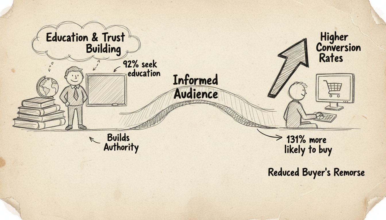
Learn why educational content drives higher affiliate conversions. Discover how building trust and authority with your audience leads to 131% more purchases and...
Join our community of happy clients and provide excellent customer support with Post Affiliate Pro.